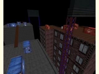
aim_midnight
an aim map ak, colt and a secret awp also some granades
the gameplay is pretty cool and ur aiming skills improve alot by playing this level
fixed so it doesnt lag that much and now u can go inside the containers
the gameplay is pretty cool and ur aiming skills improve alot by playing this level
fixed so it doesnt lag that much and now u can go inside the containers
8 Comments
You must log in to post a comment. You can login or register a new account.

 CS
CS


I see a millionth remake of akcolt with boring visuals.
Sorry, but I'm NOT downloading this.
I believe it's unfair to bash a map simply because it's an aim map with standard textures. Which doesn't mean I think it's a great map, just that you should be given some feedback on what you can improve. We'll see.
The map is basically unlit, which means it looks relatively bland because there's too little contrast. Add a light_environment for the sun/moonlight and some light entities for other light sources, or use texture lights. Light can also serve a gameplay function: bright area's are generally more attractive than dark area's, so by lighting some parts of the map more than others you can give players more sense of direction. For example, aim a spotlight on those wooden crossings, add some fancy light beam effects and players will instantly know there's something important over there.
The map itself isn't very interesting in terms of architecture: it's basically some appartment blocks. The containers don't belong on top of the buildings, small maintenance access 'houses' and other rooftop machinery would fit better.
Funny how the neonlight support beams consist of so many polygons: I got about 3000-4000 world polygons rendered on average, so I even noticed a small slowdown. I'd say, use a transparant texture instead (in case you don't know how to use them, you'll have to make that brush a func_wall and set it's Render FX (or mode?) to solid and it's FX amount to 255). Saves you some polygons, some work, and increases performance. It'll also speed up your compile time because those tiny brushes cause more work for the VIS process. Oh, the 'floor' was invisible because the max_viewable_distance is too low. You can change this through the Hammer menu: map->map properties.
As for the gameplay, I can't say much about it since it's been a while since I played CS (I never played much), but it looks pretty predictable to me. Which is probably the purpose of an aim map, but a little bit more cover and a few other places that players could pop up might be nice. Well, I don't know, players will probably like this anyway but I can imagine the map getting boring after a while because it's so predictable. Then again, I'm no aim_ player...
Second, this map is as unplayable as the first one. Type R_SPEEDS_1 in the console and look. Your wpolies are >3000, which is about twice as high as I'd recommend going with those. Your epolies are > 60000, and while I'm not sure about epoly limits, I'm sure it's way too high--even in maps saturated with high-poly props, I don't remember ever seeing a map go over 12000.
As I said the first time you posted this it's a cool idea, but you should do something to make the performance better before anything else imo.