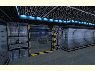
dm_aquos
 HLDM
HLDM
dm_aquos
by
Tetsu0
Posted 17 years ago2007-03-28 10:35:53 UTC •
Completed •
Half-Life: Deathmatch
dm_aquos
underwater facility deathmatch map.
Use the water to access hidden weapons and other areas of the map.
Recommended players: 4+
underwater facility deathmatch map.
Use the water to access hidden weapons and other areas of the map.
Recommended players: 4+
5 Comments
You must log in to post a comment. You can login or register a new account.


This looks great, and i shall try it out very soon.
Let me know of any problems you come across. This compile was on full everything. It only took like.. 18 minutes or so.
+The pumps were neat looking thow i could tell you just copied and pasted em around the map.
+The hallways branched out in many ways and had nice ceiling and floor trims that complimented them.
+definetly a unique way of manuvering through the map w the water
-The entire map seemed almost repetetive of itself
-The hallways seemed big and empty in some parts
-the outside water area brought you to a "too much open" area where you could basicaly see the entire outside shape of the map thow the terrain did blend it good to the ground.
Overall- the map was kinda boring in some parts because of overuse of textures in big empty areas, but the map flowed "somewhat good". It would have flown better if some of the big rooms maybe opened up to other areas with halls. ex: the huge room w one hall out and some items in the way far away corner. The map was pretty well constructed thow so just keep on mappin and remember " dont make bigol borin areas" or atleast not a lot of them.
Alright, now that that's out of the way, I'll get on to the review.
This is definitely a unique idea for a deathmatch map (being my idea, it's obviously unique), and it's generally very well implemented into the gameplay, with doors leading into the water everywhere, so as never to leave the player trapped in a corner, with nowhere to go.
You seem to have gotten the gameplay down, but the actual construction of the map got on my nerves a bit. Basically, the interior is just a bunch of copy+pasted wall sections, with some small details, lights, doors, and the occasional pushable crate here and there. Needless to say, it all seemed a bit repetitive, and it was very hard to distinguish one area of the map from another.
There were other areas that showed a bit more creativity, like the location shown in the screenshot, but even there, the brushwork was all very large and blocky, with few details implemented into the brushwork. I realize it's hard to get every area to be unique and detailed, but it just doesn't look like you put too much effort into any one part. And don't even get me started on those large security doors that lined right up with the outer wall... ugh.
Alright, moving on to the exterior now, I'd say you could have put a little more work into the general construction of it. The rocks were very repetitive, and could definitely use some major work. There were no stray rocks laying around, simply these large, single height ones, obviously there for no other purpose than to keep the player in. The exterior of the structure was also very mundane, as it was all very... squarish. It would have been nice to see some pipes coming put of the side and feeding into the ground, or at least some rounded corners on the structure. As it is, it's just a bunch of blocks connected together.
So, I guess I'd give this three stars for the effort, but with such an inventive idea (that I came up with), it seems like you could have done something better with it. Oh, and don't be surprised if you see a very similar map turn up here in the future. I still have my eye on this theme.