Stolen Thought
 CSS
CSS
Stolen Thought
by
randomscripter
Posted 17 years ago2007-04-28 01:13:54 UTC •
Completed •
Counter-Strike: Source
- Name
- Stolen Thought
- By
-
 randomscripter
 - Type
- Map
- Engine
- Source
- Game
- Counter-Strike: Source
- Category
- Completed
- Included
- BSP
- Created
- 17 years ago2007-04-28 01:13:54 UTC
- Updated
- 17 years ago2007-04-28 01:13:54 UTC
- Views
- 1368
- Downloads
- 492
- Comments
- 3
- Reviews
- 0
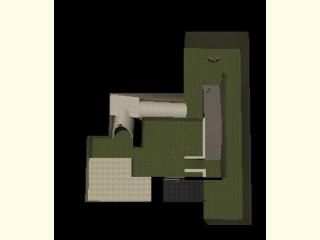
My first EVER map in any game to utilize a skybox. Please leave constructive criticism so I can do bigger and better things.
3 Comments
You must log in to post a comment. You can login or register a new account.


It's not fullbright at least, but the lighting isn't exactly inspiring. There are no shadows, anywhere, making me suspect that you have a leak in the map.
The architecture is what you'd expect from a first map attempt - loads of shapes mashed together. When I first opened Hammer, this is pretty much the sort of thing that I made too .. so don't kick yourself too much. But you've got a lot of work to do if you want to map anything that looks nice.
In a way your sloping archways look pretty cool. In another, more realistic way, they look absolutely awful. They have a few nasty glitches in parts too, where you can see right through them.
There are numerous brushwork problems. Try not to let brushes intersect each other unless the lines cross as 90 degree angles (and try to keep that to a minimum as well).
Add detail. I can't comment on improving your existing detail, because there isn't any. So adding any detail whatsoever is going to be an step forward here. You have used a skybox, but it doesn't really add that much when the map is basically a huge square box which you have cut the lid off. Try and think of a setting for your map before you even start and stick to it if you can. Use props to add instant detail to your map.
Work harder on texturing. Use appropriate textures -- grass doesn't look good as a wall texture when it's just applied to a huge cube. Use more textures, and vary them. 99% of the brushes in your map are huge with one texture repeated over them. Cut your large brushes up strategically (learn to use the clip tool) and texture them carefully. Learn to line up and rotate textures so that they fit together.
Make doors look like doors, rather than just huge chunks of miraculously mobile wood texture.
The layout of the map, while functional, isn't that great either. I've seen worse, but this has an interest span of about 2 minutes at best. Think harder about keeping players interested in playing your map.
Some ambient sound in your map wouldn't go amiss, but then again, until you have a theme going on it would be hard to make any appropriate sounds. But, when you improve, you're definately going to want to consider some.
When your brushwork and detailing becomes better you'll probably find your maps start to take much longer to compile. It is at this point in your development that you should read through this tutorial on Optimization:
https://developer.valvesoftware.com/wiki/BSP_Map_Optimization
The first time you read it, your eyes will pop out. But don't worry, understanding will develop as you practise. And there are other guides out there too, if you look for them.
Keep practising, and good luck.
http://twhl.co.za/mapvault_map.php?id=3072
Sorry the download link in that thread doesn't work anymore, though.