Aggravation
 HL2DM
HL2DM
Aggravation
by
randomscripter
Posted 17 years ago2007-05-05 21:17:13 UTC •
Unfinished •
Half-Life 2: Deathmatch
- Name
- Aggravation
- By
-
 randomscripter
 - Type
- Map
- Engine
- Source
- Game
- Half-Life 2: Deathmatch
- Category
- Unfinished
- Included
- RMF/VMF
- Created
- 17 years ago2007-05-05 21:17:13 UTC
- Updated
- 17 years ago2007-05-08 14:51:43 UTC
- Views
- 1550
- Downloads
- 526
- Comments
- 4
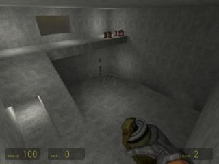
Another HL2DM map, intended for 4 players, and more experiments with glass, lighting, and my first attempt at using cubemaps.
4 Comments
You must log in to post a comment. You can login or register a new account.


I'm all for the learning curve, but why do you find it necisary to release all your experiments as completed maps, when clearly they are not.
Allow me to point a few things out:
- Again.. the textures.. why? How hard is it to define a floor from a wall?
These are all points based on the screenshot.. Fix please. THEN you can call it a completed map, and i'll download.There is more than one texture in the map, just not inside the building in the screenshot.
The texturing is not good, but it is better than your last map. You've even got loads of graffiti decals on a wall. It's something, I suppose...
You should only use the carve tool if it will only result in 90 degree angles. It allows you to make bigger maps that run well.
There's a bit more of an idea to this map than the last one, but it's still a load of basic shapes stuck together (and some carved). Only a slight improvement over the last attempt.
As Hunter said ... cubemaps only have a bearing on reflective surfaces, so without any reflective textures the only difference you will have made to this map by putting cubemaps in is how the light will shine off the players weapons, and other character models. That's good, but could be better. You definately shouldn't give up on them though. They're very important to a good looking map.
Also as Hunter said, some reason for light being emitted is always nice to see.
At least you're enthusiastic.
From the screenshot, the scale appears to be too large. Read up the proper dimensions of the architecture relative to the player.
And yes, the best mappers blend the use of props with their own architecture seamlessly. Try experimenting with props in your next map.
Think about how lighting interacts with the architecture before you construct the map. Imagine where the shadows might fall and how contrast in lighting can make the existing architecture more interesting.
Check out the tutorials for prop aligning, etc. That'll get you started on the right foot.