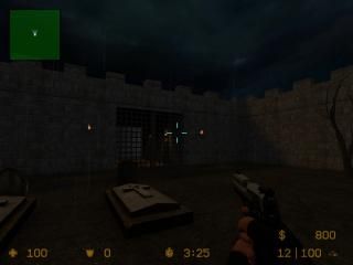
Dungeon
 CSS
CSS
Dungeon
by
SmokinAces
Posted 17 years ago2007-08-19 10:03:52 UTC •
Unfinished •
Counter-Strike: Source
- Name
- Dungeon
- By
-
 SmokinAces
 - Type
- Map
- Engine
- Source
- Game
- Counter-Strike: Source
- Category
- Unfinished
- Included
- BSP
- Created
- 17 years ago2007-08-19 10:03:52 UTC
- Updated
- 17 years ago2007-08-19 10:32:03 UTC
- Views
- 2931
- Downloads
- 552
- Comments
- 1
I have this idea for a gungame map, in a dungeon. Alot of gungame maps are outside, so wanted to change things up a bit, and have one inside. I have both the T's and the CT's spawing in same area for now, but eventually, I will have identical spawn areas, on opposite sides of the map for each one. I have a spiral staircase, leading down into the dungeon. I will have a total of 4 of these, 2 on each side. Unfortunetly right now, the top portion of some of the stairs is black! I don't know why. The lighting in the stair area, is not what it will finally be, it's just that way for now, so I can see what I'm doing. The lighting will eventually resemble that where the torches are. Please feel free to look at the map, if anyone has suggestions, or ideas, or knows how I can improve what I have so far, let me know, I'm just a beginner mapper, so would love criticism.
1 Comment
You must log in to post a comment. You can login or register a new account.


The architecture is basic (and very square), but cleanly made. I can see you're getting into good habits early on. But I would say you should experiment with more complicated brushwork. PM me if you want help.
The lighting in the starting area is much better than what I have come to expect from people's early maps. It's not "good" in the grand scale of all maps, but you've at least managed to achieve a sense of atmosphere with it, so well done.
It's raining, but it doesn't sound like it's raining.
The gate opens downwards. This seems wrong to me. Also, the texture on the top/bottom of the gate needs adjusting so that it still looks like a gate when you open it.
The spiral staircase is a nice try, but I suggest you remake it a few times and work out how to blend it into the surroudings more. Currently it's sitting inside a box, and it doesn't really look like it's part of the structure.
The starting area would benefit from a displacement floor. it would be a good place to learn how to work with displacements if you've not tried them yet.
The walls, especially inside, would benefit from having details added to them to break up the monotony of the flat textures. Try using overlays, and perhaps add detail solids here and there to make walls seem a different shape.
Keep at it. You've got potential.