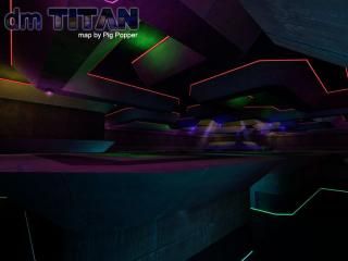
dm_titan_r1
 HL2DM
HL2DM
dm_titan_r1
by
pigpopper
Posted 16 years ago2008-02-03 13:49:12 UTC •
Completed •
Half-Life 2: Deathmatch
- Name
- dm_titan_r1
- By
-
 pigpopper
 - Type
- Map
- Engine
- Source
- Game
- Half-Life 2: Deathmatch
- Category
- Completed
- Included
- BSP
- Created
- 16 years ago2008-02-03 13:49:12 UTC
- Updated
- 15 years ago2009-04-24 03:50:24 UTC
- Views
- 1210
- Downloads
- 480
- Comments
- 4
- Rating
- 4.00 (1)
- Reviews
- 0
dm_titan_r1
4 Comments
You must log in to post a comment. You can login or register a new account.


And why did you leave the menu on when taking your screenie? You can barely make anything out now.
Texturing was suited for the theme and the light glows on the walls was a great looking feature
Weapon Placement 9/10
Weapons were well placed for a pretty even game
Design 8/10
The second level was nicely made to provide player who are up there a bit of cover from the ground but perhaps also a bit of cover from other players up there?
Ambience 5/10
Ambience also covers lighting and it was very pretty but not too harsh on the eyes but sound-wise it was a bit lame
Map Skill 7/10
Appropriate trims, breaking up textures with a center texture piece and the jump pads were very good
Total 7/10 (4 stars)
Good mapping skills you have there, refine them and keep up good work!