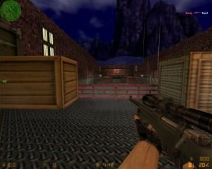
awp_2tabere
- Name
- awp_2tabere
- By
-
 Striker
 - Type
- Map
- Engine
- Goldsource
- Game
- Counter-Strike
- Category
- Completed
- Included
- BSP
- Created
- 16 years ago2008-02-13 18:11:20 UTC
- Updated
- 5 years ago2019-01-09 21:59:27 UTC
- Views
- 2992
- Downloads
- 1149
- Comments
- 3
Well , if you consider it's too bad to be in the completed maps vault , then you can move it into the example maps  .
.
Seriously , please no comments , only download , it's an awp map , and maybe some guys from here will download it .
I know , it sucks , but give me a break with the comments.
 .
.Seriously , please no comments , only download , it's an awp map , and maybe some guys from here will download it .
I know , it sucks , but give me a break with the comments.
3 Comments
You must log in to post a comment. You can login or register a new account.

 CS
CS


The texturing was was very good. Aside from the ladder sides not being textured properly and the rocks seemed a bit too repetitive (might look better as concrete or brick??) it was textured well.
Team Balance 8/10
(Because CS doesn't need entities) I think you set the teams up pretty evenly matched although there isn't a great deal of cover for either.
Design 7/10
Gotta love them killboxes. The simple design is only effective for a fast deathmatch, which is really a large portion of CS anyway!
Ambience 7/10
Yay! Someone took a bit of time! Nice simple ambience noise is all you need and the lighting was effective and set just right to allow you to see the light/dark shades.
Map Skill 5/10
Overall, anyone (and quite a few have) could have made a map like this but it is always good to see someone's own idea for the same style of map.
Total 7/10 (4 stars)
Many would disagree based on the fact it is a rather boring map with no distinctive features but I like to see maps with someone's own personality on their own, not compared with other's ideas and skills. Which is why I want to start reviewing every map that enters the vault, many maps like this get overlooked and I think it is a real shame. Anyway, good work, maybe you might extend this map further? (wink, wink, nudge, nudge
I'll make a secnod version.
The lighting I want it to be was like this : http://img180.imageshack.us/img180/4070/fdgkt4.jpg
In the middle of the map I'll place a bridge just to make things look more interesting.