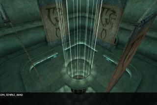
dm_temple_wad
 HLDM
HLDM
dm_temple_wad
by
Deathan
Posted 16 years ago2008-05-11 09:44:38 UTC •
Completed •
Half-Life: Deathmatch
- Name
- dm_temple_wad
- By
-
 Deathan
 - Type
- Map
- Engine
- Goldsource
- Game
- Half-Life: Deathmatch
- Category
- Completed
- Included
- BSP
- Created
- 16 years ago2008-05-11 09:44:38 UTC
- Updated
- 16 years ago2008-05-12 13:24:13 UTC
- Views
- 3059
- Downloads
- 1180
- Comments
- 4
- Rating
- 4.67 (3)
- Reviews
- 0
This is an ancient arena made for only one purpose: Entertainment.
The one who survives takes it all. All Others must die.
Deathmatch Map for Half-Life.
Small map for 4-8 players.
The one who survives takes it all. All Others must die.
Deathmatch Map for Half-Life.
Small map for 4-8 players.
4 Comments
You must log in to post a comment. You can login or register a new account.


I've seen a lot of HL maps, and I can say I've never seen anything quite like this for goldsource!
The rounded, tapered pyramidal main room was by far my favourite... besides the lighting, it didn't look like a goldsource map to me at all! kudos = )
Very beautiful architecture + very beautiful texturing = an excessive win. The lighting was also quite nice, but I think could be tweaked/improved to match the quality of the brushwork and texturing. How to achieve this is experiment with more textlights, or apply your pointlights differently, so you don't see indvidual round halos from no apparent lightsource. You can also use sprites to accent your lights to give an artificial haze, as well as fade texture to fake light beams--as i'm sure you already know looking at the quality of this map.
I love how everything is rounded and very thoughtfully constructed. The revolving moons were also neat as hell and i spent a while just sitting and watching them; you might extend the perimeter of the lower courtyard so players can appreciate them better.
Nice doodads like the moons again, the lifts, and the gigantic tubular lazer tunnel( though i didn't mess with it to figure out it's role in the map). The conveyor door thingies were also very pretty.
I only did a quick run-through, so i'm sure i didn't see all the goodies.
Letdowns:
I don't think the sky is on par with the beautiful texturing and brushwork, though I myself would be hard-pressed to make a better one.
There's no sound at all in the map. I would use custom sounds for the lifts, those conveyor entryways, and a woosh for the revolving moons too played everywhere or by each one (if they're trains) at the very least.
High r_speeds might hinder your MP fun, but i don't know that for sure, so it's more of an observation than a letdown.
Anyway, Great work on this. This is the neatest thing I've seen for Goldsource in a while. 5 stars. A great MOTM candidate imo too.
Superb!
*****
= )
Awesome is the only word I can say...
I give you five stars, because it's really hard work.
And I vote this map for MOTM!
good work man
Very nice, the blues and browns looked good together.
Entity Placement 9/10
Some nice use of lasers and conveyors. I also like the spinning spheres, they were a nice touch. The weapons were a bit heavy but otherwise suitable.
Design 10/10
A very effective multi-level arena map. I thought it was quite fun to play with a handful of people.
Ambience 7/10
Again, no sound but the lighting almost makes up for it. Wonderful lighting inside but rather dull outside.
Map Skill 10/10
Good assortment of decorative trims and the volumetric fog effect in the pit was well done, I had to actually jump down to see how you did it. Perhaps you could have applied it to the walls as well?
Total 9/10 (5 stars)
With some distinctive features, this map excells!
ALso, the lighting could be better by compiling with -extra. if you did, sorry.
Also, a little sound and ambience goes a long way. AT LEAST use trigger_sound to set what kind of echoes happen in the room to give some life.
Overall it is nice though, good choice of texturing.
EDIT: ever plan to update it? i would like to see it in smoother light. If not, well ok.