Dead Lab

Half-Life: Deathmatch HLDM
Dead Lab by Kilate
Posted 15 years ago2008-12-22 18:05:26 UTC • Completed • Half-Life: Deathmatch
Loading...
Screenshot Thumbnail
Name
Dead Lab
By
Kilate Kilate
Type
Map
Engine
Goldsource
Game
Half-Life: Deathmatch
Category
Completed
Included
BSP
Created
15 years ago2008-12-22 18:05:26 UTC
Updated
6 years ago2017-12-23 07:36:50 UTC
Views
4342
Downloads
1078
Comments
8
Rating
5.00 (7)
Reviews
0
full star full star full star full star full star Download

dm_deadlab

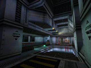
Sequence of HL1 DM map made for Level Design Contest.

8 Comments

Commented 15 years ago2008-12-24 13:52:40 UTC Comment #17191
Very small, but very good architecture throughout the map.

+5/5 Architecture
+5/5 Texturing

-4/5 Gameplay, the layout is ok, just seems a bit too linear, and not enough height.

Very nice map though, good job!
Commented 15 years ago2009-01-08 21:25:48 UTC Comment #17209
Very Good map man,
as said by Neclipse, the only thing is thar it's too small...
nice work, keep walking Johnny Walker
Commented 15 years ago2009-01-08 21:32:55 UTC Comment #17210
Good Job!
Commented 15 years ago2009-01-08 23:42:02 UTC Comment #17211
Nice.. I love this map
10/10
Commented 15 years ago2009-01-13 15:54:54 UTC Comment #17232
This map was pretty cool. You put very much detail into every area. Although you used the old halflife textures they looked pretty good. The main problem with this map is that the gameplay would be a little claustrophobic. The door ways and entrances are a little to small to fly through at high speeds. The lift didn't seem to work everytime, I would just place a trigger_multiple on it that reset quickly. The entire map was a little small in my opinion That being cramped hallways and entrances. This is a problem I used to have when I would make multiplayer maps. You should check out the map carbaseus just to see what goldsource can actually handle. Other than that with this map you showed great potential to make clean flowing architecture. Youve created a clean fluent structured map with nice textlights and mood. Besides all that, There may have been a little too much ambience another thing I used to do a lot in my maps. You definitly have what it takes to be great mapper!
Commented 15 years ago2009-02-13 21:35:40 UTC Comment #17286
Pretty neat stuff.

++Decent, interesting architecture, if a tad on the blocky side in spots
++Good use of original textures, if scaled a little high imo.
++very low r_speeds
+interesting, well designed layout(as much as i can tell without playing)
+sounds? I couldn't hear any but i'm having soundcard issues.

Good stuff, and i can't really think any negatives besides the small issues i mentioned.

Really solid, nice stuff.
5 stars
* * * * *
Commented 15 years ago2009-06-14 21:43:49 UTC Comment #11222
Awesome brushwork, i love this... 5 S.
Commented 13 years ago2011-01-22 19:58:19 UTC Comment #18772
Nice

You must log in to post a comment. You can login or register a new account.