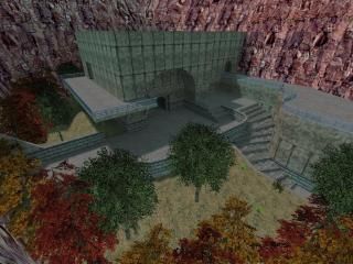
Rooms_Tetsu0
- Name
- Rooms_Tetsu0
- By
-
 Tetsu0
 - Type
- Map
- Engine
- Goldsource
- Game
- Half-Life
- Category
- Completed
- Included
- BSP, RMF/VMF
- Created
- 16 years ago2009-01-09 02:56:28 UTC
- Updated
- 16 years ago2009-01-14 01:17:17 UTC
- Views
- 4578
- Downloads
- 1039
- Comments
- 6
- Rating
- 5.00 (1)
- Reviews
- 0
Made for the community project - Rooms
Final Version.
Final Version.
6 Comments
You must log in to post a comment. You can login or register a new account.

 HL
HL


Okay, A few suggestions:
1. Make the ("Fax" brand? not sure if that was intentional) Floor wax metal instead of glass, kinda ruined the illusion for me, it looks plastic or metal to me.
2. Turn the fence into a func_illusionary and put a clip brush around it, I think players will probably have guns by then.
All in all, it was nicely done! Good rock walls, nice terrain, perhaps a few too little textures, but we have no idea how many everyone else in a given map will use, so that's good for the compiler. I like it.
I'll have to check it out when I get home today.
I'll start by saying that a lot of skill went into making this map. The general design, those nice cuvers stairways, arches and some nice detail make this a nice map to look at. The outlying terrain was also very impressive, and fit the theme well.
The cutscene was an inventive way around the keeping the playable area "room-sized" and still being able to appreciate the detail and twists/turns of the map--and i'm surprised more people didn't use them. That said, i think the whole effect of the cutscene could be vastly improved with a little tweaking:
-Start the camera motion from the point of view of the player. From there, there are all types of neat things you could do. Go high, showing he 3rd person view of Gordon(like you did at the end), pan out fast and zoom back in at neat areas, or keep it like you have it, which reminds me of the CS framerate test.
-Make sure the cutscene reflects the "more neater" parts of your map. As it is it takes kind-of a boring course, and leaves the prettier parts of the map out. (i would definitely include those pretty stairways and arches as a start)
-final suggestion for the cutscene, i would put some moving props/machines/gadgets in the camera's view path, to give some neat "bonus material" to look at while on your camera trip. A few quick suggestions: Do a goldsource take of the the valve burning-and-then-exploding barrel, rotating radar dish, sentry cannons, func_tank security cameras, machines with sound, flickering lightbulb, etc.
Anyway, this is a very well-made map and another great entry for the rooms project. 5 stars for the time and skill put into this map, even if the finished product could use a little more "finishing" imo... = )
* * * * *