Rooms Coop - Muzz
 HL
HL
Rooms Coop - Muzz
by
The Mad Carrot
Posted 16 years ago2009-02-14 12:56:41 UTC •
Completed •
Half-Life
- Name
- Rooms Coop - Muzz
- By
-
 The Mad Carrot
 - Type
- Map
- Engine
- Goldsource
- Game
- Half-Life
- Category
- Completed
- Included
- BSP, RMF/VMF
- Created
- 16 years ago2009-02-14 12:56:41 UTC
- Updated
- 6 years ago2019-01-05 16:10:45 UTC
- Views
- 4461
- Downloads
- 1193
- Comments
- 4
- Rating
- 5.00 (2)
- Reviews
- 0
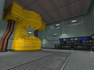
This is my entry for the rooms coop project for GoldSource.
Note to Captain Terror: Make sure you compile my map with Cliptype precise, Wadinclude the three wads and to place the rad file in the same directory as my rmf file, so that the compiler can read the rad values from it.
The map ends in the elevator. All you need to do is replace the env_funnel entity with changelevel entities.
Compiled with the Compilator with HLFix.
UPDATED!
Changes:
- Made a new reactor
- Added an unreachable floor that is visible from the main room
- Some improvements here and there
4 Comments
You must log in to post a comment. You can login or register a new account.


[EDIT]
I was right. The map is epic
++Clean, expertly, and interestingly brushed as HL maps come
++Same for textures...simply perfect, and great utilization of stock HL
++Superbly detailed
+great use of sound and speaker enitites
+Layout is very good, even though you are bruising the definition of "a room" = )
+Lighting is done very nicely and provides good contrast, even if it's a little brighter than i prefer.
Brushwork is clean and flows together smoothly from beginning to end. There are no jagged edges or errors to be found here, simply... flawless. Same goes for the texturing, as i would challenge anyone to find a single, misaligned or out-of-place texture in the entire map. Those emerald trims you use all around are beautiful, and i stared at them with delight throughout the whole map. The rest of the beautiful trims and detail in the rest of the map range from subtle to superb, and i'd probably have to play the map 5 more times and open up the source to not miss anything.
Negatives don't really exist for this map imo, but i'll try really hard to come up with some objective, more useful feedback:
-As said before, this is a lot more than "one room", but you are not the first to break this guideline for the project. The sheer quality of the entry(as in most others in this project) make up for any bending of the rules.
-The "reactor" could be styled. perhaps textured more effectively. It's "look" doesn't seem to match the quality of the rest of the map. Structurally though, i think it's pretty close to perfect, except maybe add some moar tubes and cables coming out of it at key spots.
-The pipes coming out of the reactor have harsh, squarish, 90-degree bends that look unnatural. I know you can make them better because i've seen you do it in the geometry challenges and other maps. = )
-If you ever "revamped" this map, i would consider adding another bank of blacked-out observation windows below the ones on the top floor. There seem to be too much space between the windows and the lower level. Alternatively, you could make the observation windows a lot bigger.
To conclude, this is meticulously well-made map in it's own rite, and another very high-quality map for the rooms coop project. It is going to be soooo hard to pick a winning room for this....
5 stars
* * * * *
Yeah, you're right about the reactor itself, CT, it still has a somewhat unfinished feel to it, mainly because i tried to keep the r_speeds reasonable, and stopped adding detail to it. Also, i was getting the "Too many entities in visible packet list" message (even on Full VIS!). I used a lot of func_illusionary entities to make the map compile as quickly as possible and to create as less leafs as possible. I can keep adding detail to the reactor, but in turn, something else has to go. I was thinking about the server room. If i remove that, i get some more wpolies to spend.
Ill see what i can do.
Thanks again.