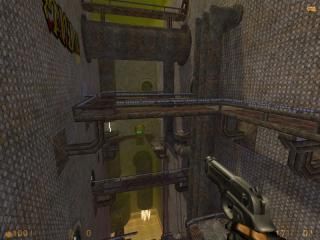
Canyon: Redux
 HLDM
HLDM
Canyon: Redux
by
darkphoenix_68
Posted 15 years ago2009-04-13 23:00:54 UTC •
Completed •
Half-Life: Deathmatch
- Name
- Canyon: Redux
- By
-
 darkphoenix_68
 - Type
- Map
- Engine
- Goldsource
- Game
- Half-Life: Deathmatch
- Category
- Completed
- Included
- BSP
- Created
- 15 years ago2009-04-13 23:00:54 UTC
- Updated
- 15 years ago2009-04-13 23:00:54 UTC
- Views
- 3645
- Downloads
- 884
- Comments
- 5
- Rating
- 5.00 (4)
- Reviews
- 0
This is a waste processing station buried in the depths of a planet-spanning megalopolis; those who work there call it The Canyon. It is my version of the original "Canyon" built a few years back by a friend of mine, hence the "Redux".
[Be warned: this is a complex level and it does not behave well under the HL SOFTWARE display driver. If your hardware limits you to using that driver, do not download this level! Sorry.]
[Be warned: this is a complex level and it does not behave well under the HL SOFTWARE display driver. If your hardware limits you to using that driver, do not download this level! Sorry.]
5 Comments
You must log in to post a comment. You can login or register a new account.


+Architecture is unique but fluent.
+Great texture use for the most part.
+Ambience is included and pretty good.
+The doors are pure awesome!
+Great use of vertical gameplay.
+Good start locations.
+Great visuals.
+/- Weapon and ammo placement could be better.
-Some lifts are way too slow.
-Some textures are a little overused.
-Same old overused sounds are used for the plats and ambience.
This map is lacking only in minute areas but really displays your abilities as an awesome mapper. It would be a definite in the rotation if we'd get a server running and i'd love to play it with you sometime. Btw im not quite sure how you made the doors roll. Are they func_platrots? This map was pretty inspirational for me to get a deathmatch map done myself. I'd like to check out you'r friend's early version. With the solidarity of everything this is a well deserving five star map.
-Explosive crates doesn't explode
-Slow elevators
I have no sound so I don't know about the ambience
Yeah, I could have done with more textures, to reduce repetition a little, but I was already hitting the 4Mb limit at this stage!
The moving platforms are slow, precisely BECAUSE the egon is so easy to get to. It may be easy to pick up, but escaping with it in one piece is another matter.
The explosive crates DO explode. Just not easily!
(A consistent complaint about my maps is that breakable stuff is too darn tough, and doesn't break with one or two shots. My thinking is that if it's gonna break that easily, it may as well not exist. If you have a crate filled with explosives you don't want it to go off every time some clumsy handler bumps into it...
Edit: The rolling doors are func_trains with a rotational speed applied. I've tweaked my own code so that they reverse rotational direction when they close, which I couldn't get to work under standard HLDM. Must investigate platrots, see if I could make them do the same thing...
Edit 2: As for the "same old overused sounds" -- yeah. I haven't really looked into adding new sounds (or more to the point, I'm not sure where I'd go to find new sounds...) Should probably investigate that further...
Many likes to this map, but a fair amount of dislikes notwithstanding:
++epic scope and size, all very carefully put together(reminds me of a star wars movie walking through it.
++epic gadgetry like the healing rooms, lifts, doors, and many other things
++epic vistas throughout and interesting structures/formations to marvel at.
--the sky was cool, but might have been improved/replaced in some areas by brushwork(like the part where you can look out the windows going up the lift, as it didn't look natural. plus some other places same thing)I'm sure tho you were limited by mapping resources to do source-like skyboxing for this.
--Texturing thoroughout is very carefully done and very good, but they are a bit repetative and wearing in a great deal of places too. like the main open area with all the pipes and lifts...it's a huge rectangle monotextured with a very simple tiling texture. a little retexturng to break it up would improve the look of this area imo hugely. (really nice looking shadows/lighting in this area btw.
-use of ambient sounds could have been much better imo.
-I like the lifts you can call, but some of the other lifts and moving platforms are maddening slow. I had no patience to wait for them, so i noclipped through much of that area.
Though this map has a fair amount of minuses imo. The pluses far outweigh them, and i'd love to see how this plays on a server.
Epic work as always, from the inimitable darkphoenix_68!
* * * * *