Alpha4th
 HLDM
HLDM
Alpha4th
by
4N!M4T0R
Posted 15 years ago2009-07-29 09:11:40 UTC •
Completed •
Half-Life: Deathmatch
- Name
- Alpha4th
- By
-
 4N!M4T0R
 - Type
- Map
- Engine
- Goldsource
- Game
- Half-Life: Deathmatch
- Category
- Completed
- Included
- BSP
- Created
- 15 years ago2009-07-29 09:11:40 UTC
- Updated
- 15 years ago2009-07-29 10:45:28 UTC
- Views
- 3268
- Downloads
- 721
- Comments
- 6
- Rating
- 2.00 (1)
- Reviews
- 0
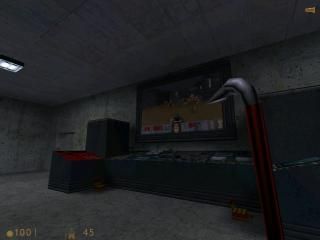
It is typical Half-Life Deathmach map.
Completed within one week.
Made by 4N!M4T0R.
Special Thanks
Valve for VHE and Half-Life.
Half-Life.lt server for testing beta version.
Daubster - Help & suggestions.
Completed within one week.
Made by 4N!M4T0R.
Special Thanks
Valve for VHE and Half-Life.
Half-Life.lt server for testing beta version.
Daubster - Help & suggestions.
6 Comments
You must log in to post a comment. You can login or register a new account.


your description lacks content.
+Warehouse boxes looked nice
+Very large map
-No sounds
-No interactivity
Incredibly boxy and empty in most areas- Try working on your corridor architecture for the future.
-Awful choice of textures
-All lights were white
-All lights were point lights
Tutorial here: http://twhl.co.za/tutorial.php?id=54