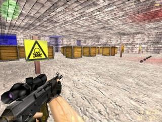
aim_kaeza_arena_02
 CS
CS
aim_kaeza_arena_02
by
kaeza
Posted 12 years ago2012-08-24 00:14:50 UTC •
Unfinished •
Counter-Strike
I know you hate aim maps, but this is one of my first maps, so I wanted to post it here to get some critical reception.
Please disregard the fact that it is an aim map.
Version 0.1.0:
Original version.
Please disregard the fact that it is an aim map.
Version 0.1.0:
Original version.
5 Comments
You must log in to post a comment. You can login or register a new account.


The roof texture is the same as the walls, pretty slack.
The map also appears full bright yet I can see some red and blue lights, what's up with that?
Architecture: It's small, blocky and has no unique detail. Crates do NOT count. 0/5
Lighting: None. (Must say I'm also confused about how you've got red and blue lights is what appears to be a fullbright map.) 0/5
Texturing: Five textures that I can see, all of which are largely repeated, andare not complimented by the brushwork at all. 0/5
Ambience: I can't say, because I haven't checked. But I'm guessing none.
Gameplay: aim map. 0/5
So yeah, there's your critical reception. Being an aim map is no excuse to be slack on the visuals. Your other maps are better (obviously, seeing as this one is a first map).
Actually, the full brightness was done by adding many lights in a reduced area, and the red and blue lights are just done by changing the coloring and again adding many lights. They are to mark the spawn points, and was actually done to test how lighting worked. As I said, it's one of my first maps ever created, so it was done poorly.
@Scotch What meant to say by 'disregard the fact...' is because on other forums and sites I visited, most users HATE aim maps. I prefer them for quick encounters at the local internet café.