Twelve Absent Men - Beta 2
 EP2
EP2
Twelve Absent Men - Beta 2
by
doodle
Posted 10 years ago2014-04-28 14:45:06 UTC •
Completed •
Half-Life 2: Episode 2
- Name
- Twelve Absent Men - Beta 2
- By
-
 doodle
 - Type
- Map
- Engine
- Source
- Game
- Half-Life 2: Episode 2
- Category
- Completed
- Included
- BSP
- Created
- 10 years ago2014-04-28 14:45:06 UTC
- Updated
- 10 years ago2014-04-28 14:49:35 UTC
- Views
- 2638
- Downloads
- 887
- Comments
- 7
- Rating
- 5.00 (2)
- Reviews
- 0
A newer version is available:To Install:
NB: Unzip the file into your common/Half-Life 2 folder
Run the first map "dew_house1" via the in-game developer console of HL2: episode 2, by doing the following:
1) Enable the developer console in the 'advanced options' of the options menu.
2)Click the tilde key '~' (top left of your keyboard).
3) Type into the box "map dew_house1" and press Enter.
BETA 2 Release - 2 new maps included - music and sounds included across all maps
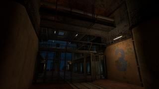
Twelve Absent Men is an episode 2 mod loosely based on Kafka's "The Trial". Featuring cutscenes, a "trial" sequence, and a prison escape section. The mod is currently in beta stage. The latter levels depicted in some of the images (of a post-apocalyptic town) - are not in the current version but will be included in future versions.
The story centres around the main character (unnamed) who has been arrested for a crime, yet never told what the crime is. Over the course of the mod the character's history will be revealed, and it will be put to question whether he actually committed a crime at all.
7 Comments
You must log in to post a comment. You can login or register a new account.


Just finally got around to playing this, sorry! (full review at GB)
Really, really great work here mister Doodle. GREAT gameplay, and just extremely beautiful and detailed work, from start to finish! Well Done Sir!
edit
I did not see that beautiful last screen. Is there an alternate ending, or did i miss it? ='(
There's currently a big compiling error on the final map that makes that one hard to finish. (It'll be fixed in my next update).
Thanks for the playthrough and comments!
Your brushwork is inspiring and I love how you went that extra mile to round off even difficult corners. The props blend in beautifully.
The downside is that the lighting is too dim. There are too many areas where I have to use the flashlight. Try putting more lights, or increase the intensity in some areas, it's too dark.
Also, try tweaking a bit the timing and action in the arena where I can use the 2 friendly turrets. It just feels like the combine are pouring without any effect on intensifying the action.
I give you 5 stars for terrific work, especially this being a beta.
re: The 2 turret area - I tried intensifying with the balcony rush and the hunter, but I might make the combine actually enter the room properly in a final rush (pre the hunter sequence), that might make things more demanding. As it is, it's a lot harder than it was previously, but I get that some more intensive mechanics might be required there.