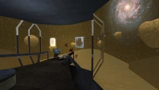
Brendanmint's Space Adventure Part 1
 EP2
EP2
Brendanmint's Space Adventure Part 1
by
brendanmint
Posted 10 years ago2014-06-05 00:48:38 UTC •
Unfinished •
Half-Life 2: Episode 2
- Name
- Brendanmint's Space Adventure Part 1
- By
-
 brendanmint
 - Type
- Map
- Engine
- Source
- Game
- Half-Life 2: Episode 2
- Category
- Unfinished
- Included
- BSP
- Created
- 10 years ago2014-06-05 00:48:38 UTC
- Updated
- 10 years ago2014-06-05 02:13:18 UTC
- Views
- 2410
- Downloads
- 652
- Comments
- 9
An old map I started almost 2 years ago. I finished it, but it's god ugly, and some of the textures glitch at points, something I never figured out how to fix. Marked it unfinished since I'm planning on redoing the whole thing. I actually forgot all about it, I've switched computers twice since I started it.
Archie was kind enough to lend his voice for a few bits where an announcer speaks, and I used my own voice(while I was sick) for another character.
I'm going to try and remake it over the next few months to try and get back into the SDK, so hopefully that goes wall.
Hope you guys enjoy this little crappy map, it's not the best, but I'd like for it to see the light of day after collect dust. Mainly because even though he only speaks like 5 or 6 sentences, Archie's voice acting is fucking amazing.
9 Comments
You must log in to post a comment. You can login or register a new account.


Gameplay is just as fun as i remember it, I really like the effects on the bridge, very eerie and believable!
The levels are really, really dark. All of the lighting is from the red emergency lights with no contrast, and they leave the levels looking completely dark.
When I got to the armory, I heard the comm system tell me that I needed to get some guns and get some armor, but I couldn't find any armor. I had no idea where the suit was, if there was one in the first place, even, and I would assume I didn't find it because of how incredibly dark the map was. The map shouldn't have let me continue on without first picking up the suit.
And I had just picked up grenades, too, so I basically had to use all of them before I could get to using a gun. This led to a very unpleasant adventure through the deck, because without a suit, gunshots do way more impact on your screen and cover it with blood. This mixed with the dark environments made most of my game look like this.
I couldn't play this on hard mode, I had to lower my difficulty down to medium because I couldn't make it past the halls after the tram ride.
Though the gravity is really cool, and I like the premise of being on the Combine's side fighting the rebels. I'll be waiting for the remake!
Minor Details are what I like to waste time on:https://dl.dropboxusercontent.com/u/28045253/Maps/2014-06-04_00002.jpg
A weird angle of the Barracks: https://dl.dropboxusercontent.com/u/28045253/Maps/2014-06-07_00001.jpg
One of the hallways, door needs to be fixed currently: https://dl.dropboxusercontent.com/u/28045253/Maps/2014-06-07_00002.jpg
Armory with dark lighting: https://dl.dropboxusercontent.com/u/28045253/Maps/2014-06-07_00003.jpg
So yeah, lighting needs to be tweaked, and I forgot to disable shadows and stuff on some things that don't need it. Progress is coming along.
I had no idea you'd released this 'til I watched your video about the revamped version. If you want me to redo the lines to be less abysmal, do let me know! Importantly I have my own place now, so I can actually project my voice.
Revamped version is looking neat! Lighting is a bit bland so far, but it's early days and already shows a lot of promise.
Can't wait to play it :3
I'm not to worried about the lines, I really don't know what else I Would want/how I would want them to sound, the ones I have I've been able to fit in.
And yea, out of everything lighting has never been my strongest skill while mapping, I'm just really bad at it. The whole project is mainly just me trying to get back into mapping in Hammer and what not, and my love for science fiction.