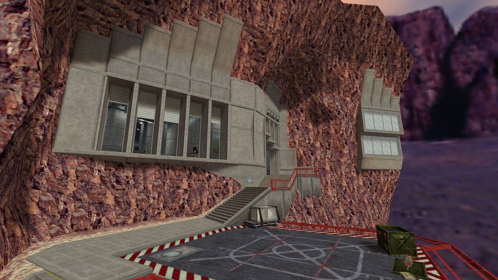
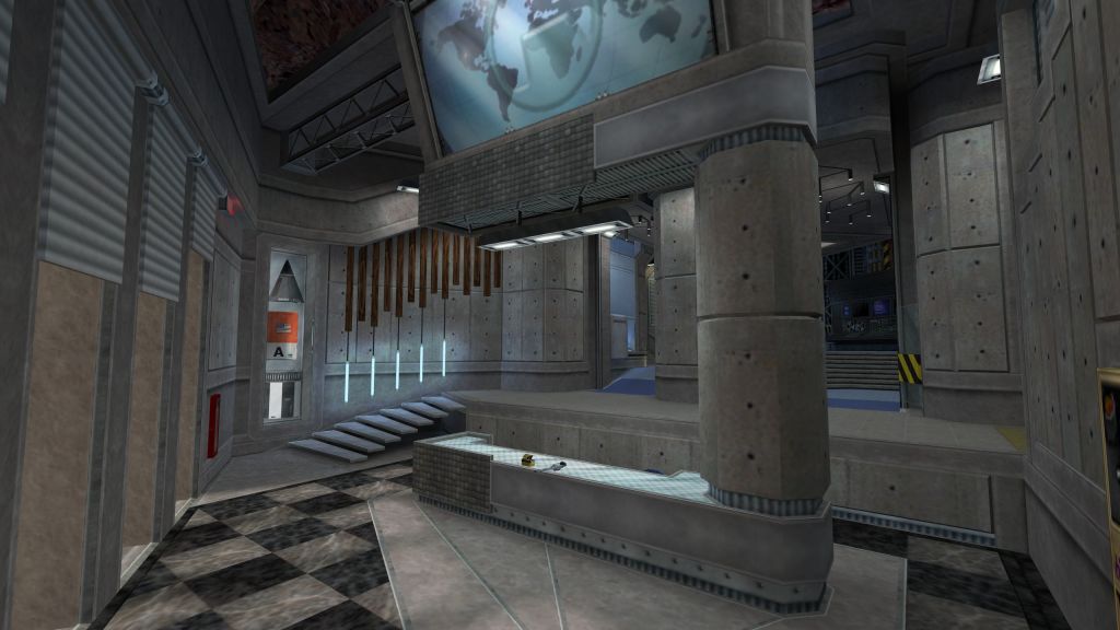
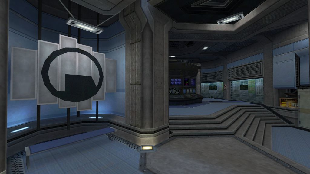
The amount of detail you've managed to cram into this map while still allowing it (just barely!) to compile is nothing short of mastery of the craft. Not that you needed them, but bonus points for the piped-in music in the lobby, and the awesome rocket launch.
Gorgeous map but not the most optimized it could be. With something like this, your VIS settings matter a lot and there are things that can be done to lower the r_speeds and increase frame rates. But overall it is a masterfully constructed map. Bravo.
Despite the high detail level, the map could've been better. Sure, a lot of hard work has been put into fleshing out every little piece of geometry, but the layout is actually quite simple, if not boring. Maybe I have missed some places where gaussjumping could be applied, but I felt like there's not enough vents to crawl and ledges, platforms or pipes to jump on, climb or walk. The lack of interaction is a flaw too, the map could have had a lot more moving parts. It wouldn't have been a big issue if many static pieces of detail also didn't look distracting. They tend to attract attention as if they were useable, especially that one yellow valve which I thought does at least something. I often found myself walking up to things and pressing Use in hopes that something will happen, but nothing did. The optimisation... Well, not like anything could be improved as the map is a bunch of very open areas with barely any hallways to serve as VIS-blockers. In some spots the wpoly count would reach the ridiculous amount of +10,000, which didn't impact my framerate much, but Bruce had 10 fps on the map at average. I do understand that this map's excessive detail is part of the idea, but that doesn't make it a better HLDM map. I'd like to mention the good usage of angled geomtry, though. It gives some areas a very interesting look. The curved parts of the map are also well done!
Clearly, a lot of effort has been put into the map. I assume the main goals were to make a very, very detailed map and to only use the stock textures. But as a HLDM map, this one isn't very interactive nor fun, leaving you to admire only its rich detail.
This map is actually one of the best maps i have ever played, but there are a few problems: 1. There is almost no interaction between the player and the map itself (Ex: Opening a door with a button that is in the other side of the map) 2. Optimization. The map sometimes kills my FPS entirely 3. Some lights seem to be placed/aligned in the wrong part of the map. Idk if its a technical issue, but its only happening on this map. Still, this is a very good map that i would definitely recomend
Quite simply one of, if not the very best Half-Life Deathmatch map I've ever played. Not that there's anything simple about this, the layout is well thought out, the details are stunningly good, and all-in-all I'm honestly quite surprised this isn't an official map.
(Finally managed to grill someone with the rocket test the other day. Hell yeah.)
I'm discovering this map a little late, but I couldn't resist to say how impressive this level of detail is, how carefully crafted every corner is, i'm in awe... Sadly the optimization is not as good and makes it's relevancy questionable being a map made for a 25yo game... But It's probably the most astonishing HLDM level using original textures I've ever seen.
We're discussing it in TWHL's Discord server, please join us! https://discord.gg/hs9wgbx
Not that you needed them, but bonus points for the piped-in music in the lobby, and the awesome rocket launch.
The lack of interaction is a flaw too, the map could have had a lot more moving parts. It wouldn't have been a big issue if many static pieces of detail also didn't look distracting. They tend to attract attention as if they were useable, especially that one yellow valve which I thought does at least something. I often found myself walking up to things and pressing Use in hopes that something will happen, but nothing did.
The optimisation... Well, not like anything could be improved as the map is a bunch of very open areas with barely any hallways to serve as VIS-blockers. In some spots the wpoly count would reach the ridiculous amount of +10,000, which didn't impact my framerate much, but Bruce had 10 fps on the map at average. I do understand that this map's excessive detail is part of the idea, but that doesn't make it a better HLDM map.
I'd like to mention the good usage of angled geomtry, though. It gives some areas a very interesting look. The curved parts of the map are also well done!
Clearly, a lot of effort has been put into the map. I assume the main goals were to make a very, very detailed map and to only use the stock textures. But as a HLDM map, this one isn't very interactive nor fun, leaving you to admire only its rich detail.
Texturing — 10
Ambience — 10
Lighting — 9
Gameplay — 9
1. There is almost no interaction between the player and the map itself (Ex: Opening a door with a button that is in the other side of the map)
2. Optimization. The map sometimes kills my FPS entirely
3. Some lights seem to be placed/aligned in the wrong part of the map. Idk if its a technical issue, but its only happening on this map.
Still, this is a very good map that i would definitely recomend
(Finally managed to grill someone with the rocket test the other day. Hell yeah.)
Those who complain on optimization must have computers from 2000's. My 10 years old computer runs it just fine.