aim_smg
 CS
CS
aim_smg
by
Jaw HammerFreek
Posted 20 years ago2004-01-20 05:00:44 UTC •
Completed •
Counter-Strike
- Name
- aim_smg
- By
-
 Jaw HammerFreek
 - Type
- Map
- Engine
- Goldsource
- Game
- Counter-Strike
- Category
- Completed
- Included
- BSP
- Created
- 20 years ago2004-01-20 05:00:44 UTC
- Updated
- 20 years ago2004-01-20 15:43:35 UTC
- Views
- 1560
- Downloads
- 537
- Comments
- 7
- Rating
- 3.00 (3)
- Reviews
- 0
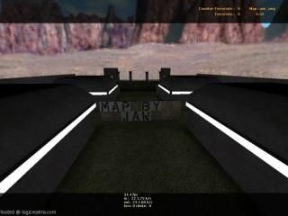
this is a aim map, you get to use smg's only, such as the mp5's and p-90's. Let me know what you think please.
7 Comments
You must log in to post a comment. You can login or register a new account.


But, when i played it, it seemed kind of good actually(there are ofcourse flaws).
Positives:
+ Good, iceworld-like, architecture.
+ Stairs to a camping spot
+ Cool lights on the wall
+ low r-speeds
Negatives:
- The stairs look like SHIT
- "made by JAW"-text is white/black(make it with the Decal tool)
- Un-breakable glass
a... 2.5... But we can say 3 cause im nice.
unbreakable glass, so its harder to kill someone through the glass.
the text: because the map is a bit dark, so I wanted the text to stand out.
stairs: how do the stairs look like shit? please tell me.
4 for interesting structure
3 for textures and sky (grey, grey grey..)
4 for idea only SMG's (UMP45 still missing