i'm on lunch break so i'll keep this as brief as my fingers allow
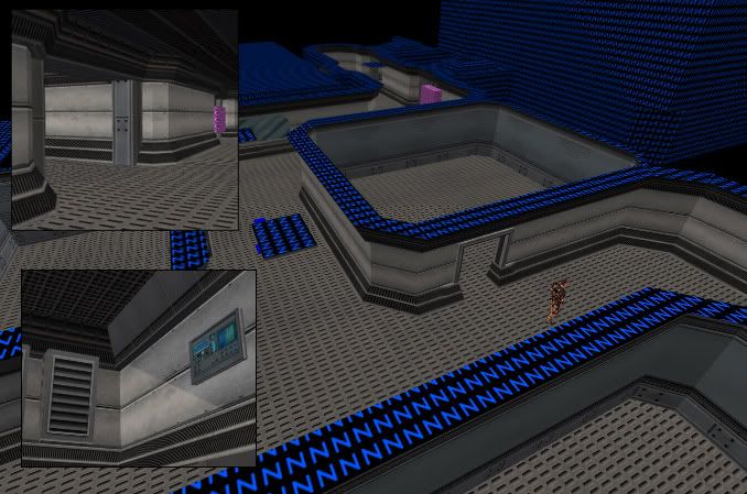
it's a base.. on the moon... using submerged textures from my homie PhillK
i don't know what it's for or what i'm going to do with it or how long it's going to take until it's done but i'm open to suggestion. (unless it's from that fattie Polito)and full size screenshots are here
http://hydeph.cs-irc.com/images/tinker/moonbase/
thoughts/comments/suggestions/ etc all welcome
back to work bai~~~~~~~~
moonbase
Created 18 years ago2006-07-07 12:38:45 UTC by
 hydeph
Created 18 years ago2006-07-07 12:38:45 UTC by
![]() hydeph
hydeph
Posted 18 years ago2006-07-07 12:38:45 UTC
Post #189117
Posted 18 years ago2006-07-07 12:47:58 UTC
Post #189119
Brushwork seems fine, just needs less-repetitive texturing in my opinion.
Posted 18 years ago2006-07-07 12:49:09 UTC
Post #189120
Ugly? Did you even look at the other screenshots? It just looks to me like the detail brushwork hasn't been put in yet.
Posted 18 years ago2006-07-07 13:11:22 UTC
Post #189124
Its a good start, but i do hope that you fill it up with stuff.
Increase the light gamma and contrast it more with more intense light to bring out the detail of them nice Natural Selection textures.
Increase the light gamma and contrast it more with more intense light to bring out the detail of them nice Natural Selection textures.
Posted 18 years ago2006-07-07 14:09:44 UTC
Post #189127
Looks like a good start, thoug hthe hughe open spaces dont make sense to me, a moonbase would probably be pretty cramped or atleast using it space to the max. Imagine the cost of getting it all up on the moon.
Posted 18 years ago2006-07-07 14:28:11 UTC
Post #189135
http://hydeph.cs-irc.com/images/tinker/moonbase/moonbase.jpg
Im not so sure about this. You have many unnecassary brushes on that part, which increases r_speeds. Probably not a big problem at this stadium, but its always a good idea to keep things as efficient as it can be. For example, you have a shape like this in that screenshot:
| 1
| /
Its a just a question of Vertex Manipuation or clipping (cutting).
Im not so sure about this. You have many unnecassary brushes on that part, which increases r_speeds. Probably not a big problem at this stadium, but its always a good idea to keep things as efficient as it can be. For example, you have a shape like this in that screenshot:
|--------|
|   1      |2
|           |  /
|--------|/
| ----- |
| /
| -------/ |
Posted 18 years ago2006-07-07 14:42:47 UTC
Post #189146
Looks pretty damn nice.
I like the gloomish lighting, perhaps some orangeish/reddish spotlights to spice it up a bit?
I like the gloomish lighting, perhaps some orangeish/reddish spotlights to spice it up a bit?
Posted 18 years ago2006-07-07 16:21:24 UTC
Post #189175
indeed, the details are not present.
i had planned ventilation systems, electrical systems, computers, and all like that throughout the base, in the walls, in the ceilings. as for lighting i was thinking blues, purples, greens and reds.
also, pepper, it's a video game. cost is not an issue. although i appreciate your logical approach, it would be pretty silly to make a map with hallways wide enough for one or two players.
Posted 18 years ago2006-07-07 16:51:15 UTC
Post #189179
I've seen this pic months ago (By months i mean like half a year or something)
http://hydeph.cs-irc.com/images/tinker/moonbase/moonboner.jpg
http://hydeph.cs-irc.com/images/tinker/moonbase/moonboner.jpg
Posted 18 years ago2006-07-12 17:14:31 UTC
Post #189855
here's an update
Posted 18 years ago2006-07-12 17:15:36 UTC
Post #189858
Hmmm... It's just so damn... Bland.
Posted 18 years ago2006-07-12 17:24:56 UTC
Post #189862
ooh, thank you for your outstanding vigil of constructive criticism
Posted 18 years ago2006-07-13 13:01:30 UTC
Post #189948
Maybe some pulsating red/blue/orage light might spice it up just a little, as well as the odd computer console...
Just a thought...
Just a thought...

Posted 18 years ago2006-07-13 13:08:14 UTC
Post #189949
More gadgets, pipes, futuristic stuff would really do wonders..
Posted 18 years ago2006-07-14 06:00:10 UTC
Post #190050
Agreed...By the way I like how you presented that last picture...Something about it made me think wow for a few seconds before I noticed the comments under it ;P
You must be logged in to post a response.


