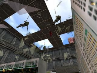
Hostile Takeover

Half-Life HL
Hostile Takeover by ministeve
Posted 20 years ago2004-07-13 14:10:04 UTC • Unfinished • Half-Life
Loading...
Screenshot Thumbnail
Name
Hostile Takeover
By
ministeve ministeve
Type
Map
Engine
Goldsource
Game
Half-Life
Category
Unfinished
Included
BSP
Created
20 years ago2004-07-13 14:10:04 UTC
Updated
20 years ago2004-07-17 09:21:16 UTC
Views
3896
Downloads
998
Comments
8
Download

one of the final versions of my hto map. give feedback and ill improve upon it.

8 Comments

Commented 20 years ago2004-07-14 15:54:44 UTC Comment #2706
What changes did you make so far?
Commented 20 years ago2004-07-15 08:24:27 UTC Comment #2721
umm...i hope i updated the zip. you should see the blood in the corridor.
Commented 20 years ago2004-07-16 09:31:57 UTC Comment #2736
2 stars? it had 3 before i updated.
Commented 20 years ago2004-07-16 15:19:10 UTC Comment #2741
why the hell has this been voted down from the last version?
Commented 20 years ago2004-07-16 15:32:15 UTC Comment #2742
Sort out the lighting!
Commented 20 years ago2004-07-16 17:03:05 UTC Comment #2743
Someone suggested I get more involved with TWHL. Ok, I will. Well where should I begin? How about the beginning. The fade ins take way to long, just let me play, especially since the map is so short. Who wants to spend a fifth of the time it takes to complete this tiny map in complete darkness. The computers and the entire room for that matter look like crap. Just a big block with identical computers cycling through the identical animating textures at the same exact time.
Theres no detail anywhere in the map that I could see. Just basic blocks with poorly alligned textures on them (like on that sign by the sparking door and many other places.) The slanting texture on the walls of the ramp looks rediculous. Learn to apply textures.

Those cylinders with the gray glass that do nothing look awful. I dont even know where to start with them. So I'll just say the look terrible. That whole room looks way too repetitive and boring. The whole map was boring for that matter. What is there to do in it? You walk down 2 hallways and a through a room, see some stupid looking puff of smoke, and shoot a few sollys and one monster. Big deal.
Since the whole map looks like it took you 10 minutes to make, I suggest starting over, AFTER you read the beginning tuts here and learning how to make something other than boxes and a cylender.

Very poor attempt at a hl map. I'd give zero stars, but the lowest I'm allowed to give is 1.
Commented 20 years ago2004-07-17 02:39:03 UTC Comment #2748
Upon further consideration, I believe this map deserves 2.5 stars instead of 1.
Commented 20 years ago2004-07-24 22:08:21 UTC Comment #2850
I reckon it's a great start to a map & I give it a 3.5/5.

You must log in to post a comment. You can login or register a new account.