cs_bank
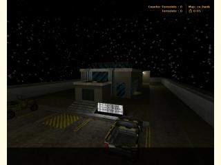
This is my first map. I think it is nearly complete, but I want to know what things I should adjust/fix. There's technically room for ten on each team, but it would probably be better 5v5. Some features I want to make sure everyone knows about:
In the security room (2nd floor, the "Security" door) there is a lightswitch that disables all internal lights, then dimmer "emergency" lights are turned on. Also, there are three terminals in there, each of which is tied to a trigger_camera. I think they track an invisble object, but not always. The custom wad is just for the sign out front. Host
In the security room (2nd floor, the "Security" door) there is a lightswitch that disables all internal lights, then dimmer "emergency" lights are turned on. Also, there are three terminals in there, each of which is tied to a trigger_camera. I think they track an invisble object, but not always. The custom wad is just for the sign out front. Host
9 Comments
You must log in to post a comment. You can login or register a new account.

 CS
CS


4/5, great layout.
Okay, thanks to Seventh-Monkey and others, I've adjusted the door height to a more reasonable 84 in. I originally had them that high to make sure that any uneven terrain wouldn't make people travel through the door. I also removed most of the door sounds, except for the ones I thought were still appropriate. I think I fixed most of the lighting problems, adding func_walls and such. Right now, there are three things I've heard, so far, that this map needs:
Texture lights (Anyone know how to set a brush entity's style to Group?)
Rework the front windows (Just 2 vertical ones, or what?)
More security to get to the vault (any ideas?)
tex lights: there is a tutorial on this in the.. tutorials section
group? right click?
Either move those objects that Seventh mentioned away from the walls, or incorporate them into the walls if you need them to be flush, which would be a good idea to minimize snagging and things of that sort.
Second, add lasers in the middle of the door so that only when you open the door u see them. Add another picklock thing accept this time when you do it, it turns off the lasers. Make sure you label this security features or something so that people know which is which and put it on another wall that you might not notice when u just turn the corner.
Third and last, I forget if the door of the vault shut by itself but if it doesnt you should make it like 3 seconds so that they need to get in and out fast.
I would say that you should do the first and second ones but maybe the third is going from challanging to stupid and annoying.
There are some errors and face splitting, but it all looks so good, I don't think people will mind too much.
Layout doesn't seem too big or small, and seems like it would be good.
Besides optimizing and cleaning up small things, I can't really think of anythng to add.
Superb stuff!