Help?
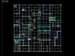
I dont kno if wut i am doing is right or not. My map looks realy dull but i think the layout is pretty good. some help would be appreciated on how to get all the entities workin and get it running so i can learn to make better maps. Steve_canada_12@hotmail.com
9 Comments
Andy
Commented 21 years ago2003-09-28 03:13:27 UTC
Comment #255
Massive Map... as big as the grid. Detailed e-mail on the way Steve. Oh yeah, forgot to mention, don't name your maps with a gap in them.
kol
Commented 21 years ago2003-09-28 07:27:04 UTC
Comment #258
or capital letters for that matter, can really mess up your level transitions later on
Seventh-Monkey
Commented 21 years ago2003-09-28 11:26:03 UTC
Comment #259
Fewer than eight letters is good too. Farewell, good companions.
pepper
Commented 21 years ago2003-09-28 15:05:06 UTC
Comment #261
basic layout is good only ot big wathc the door texture and use that as scale but i think andy mentioned ths in his mail
colganc
Commented 21 years ago2003-09-29 12:13:35 UTC
Comment #267
Also if you need a reference for how big the player is, look at the player_start entity boxes. They are about how big the player is.
HaX Clan Leader
Commented 20 years ago2004-01-21 13:08:30 UTC
Comment #793
if u put in a space and u want to change ure map in the console put a _ instead of a space wherever it is!
EDEdDNEdDYFaN
Commented 20 years ago2004-07-14 14:24:24 UTC
Comment #2704
The map has to be a bit smaller, because it is touching the edge of the grid. It makes compiler angry.
robcwise
Commented 19 years ago2005-07-07 17:27:20 UTC
Comment #8069
You can't run the map with out a cover, its a major leak, bad textures, be more artistic. Its to big you need to make it smaller.
Jessie
Commented 7 years ago2017-12-10 04:56:38 UTC
Comment #21116
Goodness. Scale is out the window, not enclosed, player_starts in the ground, textured terribly (a.k.a. not at all), plain bizarre design elements. I'd suggest starting a lot smaller and building up, not the other way around.
You must log in to post a comment. You can login or register a new account.

 HL
HL

