stfu_and_climb
 TFC
TFC
stfu_and_climb
by
waTchouT
Posted 19 years ago2005-02-15 11:47:40 UTC •
Completed •
Team Fortress Classic
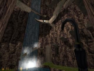
-a climb map for tfc. i thought a new one was needed. It uses the limits of the Z axis
-its made harder than the others to give people a challenge.
-ive only managed to complete it once , and it took me ages.
-some people have done it in 6 minutes, try and beat that
-the not great visuals because its a climb map with hundreds of brushes vsisible meaning high r_speeds but ive made it so there is some visblocking
-u really have to play it as the screenshots dont really show it off too well .
-its made harder than the others to give people a challenge.
-ive only managed to complete it once , and it took me ages.
-some people have done it in 6 minutes, try and beat that

-the not great visuals because its a climb map with hundreds of brushes vsisible meaning high r_speeds but ive made it so there is some visblocking

-u really have to play it as the screenshots dont really show it off too well .
17 Comments
You must log in to post a comment. You can login or register a new account.


Yours is nice, simple and not as hard as that map i just talked about!
+ Nice name for map
+ Nice waterfall
+ Nice Clipping
+ Nice, Simple Map
- Nothing at all, but maybe expand more and make a sequel or make this map bigger, or finally import to HL2!
And yes, I do realise the irony of saying that a year and a half after your last comment.
Yoohoo! Mapper!
I recall a Dimbark, are you him? It was created for the feckin-mad server originally. The bison server was a side project several years later after creating a plugin to automatically convert the kz_ climb maps to function in TFC.
I shortened my alias to "watch" not long after making this map and have only played occasionally since about 2009/10, but feckin-mad is still running thanks to many kind souls donating server hosting over the years.
I did however make the sequel to this, stfu_and_climb2_beta1, it looked better and had monkeys! Speak to you in another 11 years!
and also gonna comment for this map, yeah it is awesome, but today i only tried its beginning sections a little.
but im gonna rate and give 5 stars because i like it, yeah that sky in the ceiling looks somekind cut, i guess this is because visibility settings. but thoese ledges and overall concept design looks nice, and its fun.