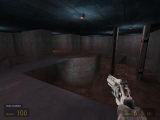
dm_higherground
 HL2DM
HL2DM
dm_higherground
by
raiseyourfist
Posted 19 years ago2005-02-20 17:12:22 UTC •
Unfinished •
Half-Life 2: Deathmatch
- Name
- dm_higherground
- By
-
 raiseyourfist
 - Type
- Map
- Engine
- Source
- Game
- Half-Life 2: Deathmatch
- Category
- Unfinished
- Included
- BSP
- Created
- 19 years ago2005-02-20 17:12:22 UTC
- Updated
- 19 years ago2005-07-17 08:21:43 UTC
- Views
- 1296
- Downloads
- 496
- Comments
- 9
I basic layout for a HL2:DM map... just want to see if you kids like the layout. The texturing/architecture most definetly not done. Give input on weapon locations, etc.
9 Comments
RabidMonkey
Commented 19 years ago2005-02-20 20:03:16 UTC
Comment #6073
Screenie it 

Habboi
Commented 19 years ago2005-02-21 16:08:55 UTC
Comment #6080
Please 

raiseyourfist
Commented 19 years ago2005-02-22 12:49:42 UTC
Comment #6086
there ya go, I would have put one up earlier but I've been busy.
Habboi
Commented 19 years ago2005-02-22 14:51:52 UTC
Comment #6089
That ceiling texture looks odd, change it to something shiny like metal!
raiseyourfist
Commented 19 years ago2005-02-23 02:55:53 UTC
Comment #6096
Did you read anything up there... it sais "texturing/architecture most definetly not done." It's an idea for a layout, I just threw some textures on.
LittleTortilla
Commented 19 years ago2005-02-23 14:34:54 UTC
Comment #6099
In terms of just the layout like you said, I really dont like it. Its way to small and seems just like an Overdeathmatch level. But then again some people like small maps like these that are just like KILL KILL KILL KILL, oh and KILL SOME MORE. I am not one of those people, id prefer something with atmosphere and reasoning behind it, and not die the second I respawn 20 times in a row. But id bet when your done with this it will show up on a server before my map canyon oasis, or rabid's petrol level (which is very badass) ever does. Its just the way of the world  Good luck with the killing.
 Good luck with the killing.
raiseyourfist
Commented 19 years ago2005-02-23 20:34:37 UTC
Comment #6102
Thanks bro. To some extent I agree, maps with a good ambienceare alot of fun of play, but I sometimes I just feel like playing a map like this. They are small, and reasonably easy to plan out, so I chose this idea as a first map for the source engine. I've actually settled on a bigger, and I think better layout, still based on roughly the same concept.
otherman
Commented 19 years ago2005-03-02 02:57:23 UTC
Comment #6168
hmm.... Jared.... hmmmm... if you can explain the strangeness of my weapons on this map, DONT blame it on my comp. I know you've done better, keep up the good work. Not bad for a first map on source. Coming from a proffesional ;D i think fullbright needs to go and maybe more textures, otherwise its fairly good. More of a 2-4 person map though.
raiseyourfist
Commented 19 years ago2005-03-04 01:25:31 UTC
Comment #6181
Hey Shane... you've never made a real map. Second of all... it is your computer. Third of all... the map is just a test for the layout, the textures are not final, neither is the fullbright, when I said "The texturing/architecture most definetly not done" I meant the texturing and architecture is definetly not done. Next time if you want to complain about something, come to my house, don't go on the net, because you don't know anything about actual mapping. Thank you and goodbye.
You must log in to post a comment. You can login or register a new account.


