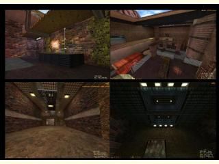
xdm_destroy
 HLDM
HLDM
xdm_destroy
by
rend0us
Posted 19 years ago2005-08-11 00:16:56 UTC •
Completed •
Half-Life: Deathmatch
- Name
- xdm_destroy
- By
-
 rend0us
 - Type
- Map
- Engine
- Goldsource
- Game
- Half-Life: Deathmatch
- Category
- Completed
- Included
- BSP
- Created
- 19 years ago2005-08-11 00:16:56 UTC
- Updated
- 18 years ago2006-07-28 23:07:29 UTC
- Views
- 1913
- Downloads
- 761
- Comments
- 10
- Rating
- 3.00 (3)
- Reviews
- 0
UPDATED LINK>>>>>>>>
half-life death match map, sort of a killbox arena type. I used some hl2 textures, map plays verry smooth. post comments please or ratings. Im intrested in mapping for a mod.
rend0us@aol.com
half-life death match map, sort of a killbox arena type. I used some hl2 textures, map plays verry smooth. post comments please or ratings. Im intrested in mapping for a mod.
rend0us@aol.com
10 Comments
You must log in to post a comment. You can login or register a new account.


Lighting is overall good, but you should give up on using light entities and rely only in texlights and light_enviroment. Some parts of the map just have a glow that noone knows where it came from. It makes those parts look like they are still in beta-testing stage.
The layout supports great long range combat, as well as providing places where the longjump and gauss jump are useful!
One more thing: some of the fences looked fullbright, rendermode= solid and fxamount=100 will make them look right.
My review:
***************************
+ Architecture. Some places looked very nice.
+ Layout.. Pretty interesting...
-/+ Gameplay. Not the prefect setup, but it can be playable
- Ambient sound. Apart from the teleporter sound - no ambience in the map!
- Texturing. I didn't understand, where this map is. Textures differ with every room and just don't add up to me...
*************************
Well in total - I'ts a good map, needs some work, but it's ok. Good work
Looks good and what people are saying i'm sure it is very good
And the most important YOU USED LIGHT ENTITIES. Use textlights.
BTW map didn't run in dm (gave me some gay error) for me so maybe thats the problem why i got these bugs.