cs_destruction

Counter-Strike CS
cs_destruction by Taylor
Posted 19 years ago2005-08-29 00:56:37 UTC • Completed • Counter-Strike
Loading...
Screenshot Thumbnail
Name
cs_destruction
By
Taylor Taylor
Type
Map
Engine
Goldsource
Game
Counter-Strike
Category
Completed
Included
BSP
Created
19 years ago2005-08-29 00:56:37 UTC
Updated
18 years ago2005-12-28 20:21:26 UTC
Views
2765
Downloads
806
Comments
10
Rating
4.20 (5)
Reviews
0
full star full star full star full star half star Download (571.2kb)

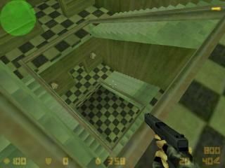
Hey, this is my second uploaded map, and it's also a bit matrix-like, like my previous map. Actually the main building is part of the movie, I tried to make it in worldcraft...see the result, and please write comments. Oh, and sorry for the shitty screenshot, I was in a hurry...

10 Comments

Commented 19 years ago2005-08-29 01:01:28 UTC Comment #8734
Looks pimp. Downloading.
Commented 19 years ago2005-08-29 01:05:00 UTC Comment #8735
Sorry Hrny if you couldn't download it for the first time, my link was fucked up. 3 minutes later I fixed it...
Commented 19 years ago2005-08-29 01:24:49 UTC Comment #8736
I like the Matrix theme. The proportions are a little off but it creates a nice surrealistic experience. The furniture is a nice touch as well. Very well done for you second map.
Commented 19 years ago2005-08-29 09:47:27 UTC Comment #8747
A small tip: when making stairs, make sure the texture alignment in each is step is a bit different than the ones next to it. (Look at the part of the screenshot where the crosshair is)
Commented 19 years ago2005-08-29 22:01:35 UTC Comment #8762
I thought it was kinda interesting. Pretty good for a second map.
Commented 19 years ago2005-08-30 07:08:49 UTC Comment #8764
Commented 19 years ago2005-08-30 18:16:06 UTC Comment #8791
Thanks for your comments Onslaught, by the way, I tought that the layout is crap...I'm happy that you think it's not. And I used the night sky for it, at least I typed it in the map properties, but it dosen't seem to work, I don't know what's the problem with it.
Commented 19 years ago2005-08-31 03:16:44 UTC Comment #8793
My review:
**************
+ Lighting. I liked the greenish theme.
***************************
+/- Architecture. some objects were good, but the map was a lil blocky.
+/- Texturing. It was alright, but the outside of the houses looked terrible.
*******************************
- Layout. The hostages are too far from each other, that makes the map T friendly. I didn't like those streets, blocked by wooden fences. VERY unrealistic..
- Gameplay. It's bad because of the layout.
- Ambient sounds. Add some.
********************************
Well in total - this map isn't a masterpiece, but it's ok. You should work more on gameplay and realism, and you'll have a great map. :)
Commented 19 years ago2005-09-26 18:22:46 UTC Comment #9194
This map is awsome and is so like the building from the matrix, where Cipher betrays them. You even added the place where neo takes the pill and the main wet wall!!!

+Beautiful texturing / architechtre / lighting
-no ambient sounds :(
+Kick Arse Stairwell!
+nice detail items, and props, but maybe add a couple more ; )

Overall, great job dude!
Commented 19 years ago2005-09-30 19:39:27 UTC Comment #9289
Thanks, I've put some work in it (especially the inside of the building), my classmates told me that its crap (they don't even build maps, waheva') but I'm happy, that some people do like it

You must log in to post a comment. You can login or register a new account.