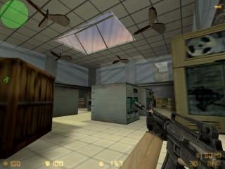
de_stack_v2
- Name
- de_stack_v2
- By
-
 Duffm@n
 - Type
- Map
- Engine
- Goldsource
- Game
- Counter-Strike
- Category
- Completed
- Included
- BSP
- Created
- 19 years ago2005-10-26 10:53:09 UTC
- Updated
- 19 years ago2005-10-27 05:40:21 UTC
- Views
- 1800
- Downloads
- 680
- Comments
- 7
- Rating
- 3.33 (3)
- Reviews
- 0
ITS FINALLY HERE!!!
After spending ages on this map i have finally put together a 'finished' verison fully vis'd for once. Lag is down now, and i when i was testing it, i was getting about 70fps.
(The map works really well with bots, almost no problems, althought they wont go upstairs.)
New textures
Improved layout helping gameplay drastically
fully vis'd
fixed some bugs in the last stack map
and some cool other things!
Download this map! Its by far my best map so far. I must of been working on this map for at least 50 hours.
Thanks, Duffm@n.
7 Comments
You must log in to post a comment. You can login or register a new account.

 CS
CS


+ layout. great for getting the adrenaline pumping!
+ size. not too big, not too small
+ you are right. the fps are darn good!
+/- lighting. a lot of light seemed to be coming from nowhere!
+/- more ambience sounds. you can never have too many...well...mmm
- texture application - seriously dude!
- i got a bit bored quickly. maybe some interactable sequences, you know, like falling boxes, a computer explodes when you press a button around the corner sort of thing.
- at some points, like around the glass windows, you should add a sort of frame, it looks stupid with glass touching very bottom... or is that just me being fussy!?!?!
otherwise, very good! 3.8 stars.
+Nice detail in places
+Interesting original layout
-Too many props strewn in some areas and others left barren
-ropes? do they have a purpose--I tried jumping too them for a while? I think it would be cool if the ct's started atop the roof and took the ropes down.
-random glass thingies everywhere--yuk!
-weird secret passages with arrows that don't make sense
It's obvious that you have mapping skills and put some time into this, but I think it needs some rethinking.