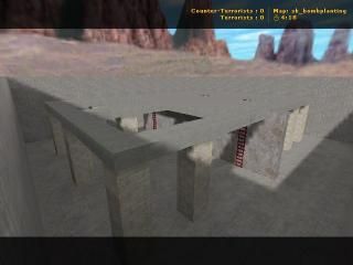
sk_bombplanting
 CS
CS
sk_bombplanting
by
sarwan
Posted 18 years ago2006-03-13 11:20:36 UTC •
Completed •
Counter-Strike
This is my first map.
Please Send me Some Advice.
Please Send me Some Advice.
15 Comments
You must log in to post a comment. You can login or register a new account.


reasons
1) 3 textures
2) its. a. box
3) commented on own map
4) no map description
5) wtf is sk_?
Sarwan: Practice mapping some rooms and try some common objects.
Stairs, door frames, balconies, platforms, catwalks, Light fixtures, trims, arches, etc.
Also, try some of these great tutorials.
http://twhl.co.za/tutorialbrowse.php?tuttype=1
i give it a 2
for reasons that its better than most of my early stuff
@Hunter: de_spaceship3 ring a bell? :
I won't move this to the unfinished vault, just because it's a 1st map, that is quite well-made for a FIRST MAP.
@Sarwan: Good work. I can't say that the map is very good, since it still needs some better texturing and architecture. Add more textures and other things, like Rimrook said. And post a better description next time.
Just do what these guys said and improve...
Trust me I have to be harsh to be nice since everyone esle did the same to my first map and look at me now! I am a retard!
Take notice from what they said, as for the rest, ignore those..
Better than my first string of maps, considering it's lit!
Some interesting shadows because of the surrounding wall and the holes in the ceiling. This might be a good frame for a "ruins" type map, with some ugly blown out wall textures, some wall fragments and debris props, and some sounds.
Some of what Hunter and the others has merit though--this map would never survive at Snarkpit methinks...
And though I understand the negative feelings, just keep reciting the mantra, straight from the father:
This is a learning site.
This is a learning site.
This is a learning site.