Halo 2 Elongation
 HLDM
HLDM
Halo 2 Elongation
by
mustang67
Posted 18 years ago2006-03-16 00:35:19 UTC •
Completed •
Half-Life: Deathmatch
- Name
- Halo 2 Elongation
- By
-
 mustang67
 - Type
- Map
- Engine
- Goldsource
- Game
- Half-Life: Deathmatch
- Category
- Completed
- Included
- BSP
- Created
- 18 years ago2006-03-16 00:35:19 UTC
- Updated
- 18 years ago2006-03-22 19:21:58 UTC
- Views
- 1648
- Downloads
- 601
- Comments
- 16
- Rating
- 2.50 (2)
- Reviews
- 0
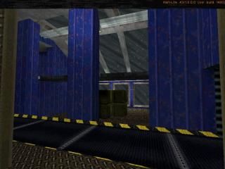
a remake of Elongation from Halo2, i know i doesnt look exactly like it but its close. the zip contains versions with and without boxes, and with texture light (dark) and with point lights (bright). Alos contains the HaloAR v,p, and w model; as well as Shotgun v model, and shotgunshell model.
16 Comments
You must log in to post a comment. You can login or register a new account.


DL-ing!
as for thet columbs, thats what they look like in halo
This map is seriously, not suited for hldm.
The map is to small and cramped, textures & lightning are horrible!
Also, ammo and a gun at the same place? No, that just looks ugly.
I like the convoyer thought, they are allways fun.
If your boxes are a func_train, you can light them in a seperate "box" someplace on the map so they're all lit properly--like the train at the beginning of HL.
The rest of the lighting is far too bright...as someone already said--it looks fullbright!
I personally like the small layout of the map, but really have no idea how it would play until I played it. Probably a bit too small, considering you can circumvent the entire map in 30 sec
If you did not use texture lights, I would recommend using them.
All in all, very nice-looking map and nice concept.
it is small but then again i ment for this to have 4 people playing (thought there are 6 start points)
From the shadows, it looks like your still using pointlights, but whatever--give textlighting a try sometime!
You pipes and wires look great, but you might consider experimenting with other textures and texture scales to make them look better. They look fine, just the lighting on them is a little weird in places. PM me if you want to explore this any further...
Excellent work. I really like how this map looks/feels. The conveyors remind me of the Droid factory from Star Wars II
Nice ambients too btw.
I'm glad you fixed the ammo/weapon thing.
The lightning is a lot better, but still needs major improvement.
It seems you're (like rowley said) using pointlighs.
Textlightning is a lot better looking.
I think you should make the lightning a bit more darker.
Keep the same lightning over the map, besides the funky red and blue between the 2 convoyers.
1 more thing, between the 2 convoyers you have a floor texture on a wall, change that, because it really looks ugly considering you have that floor texture also on the floor!
-both free-
Slackiller has got some links to texturing sites, which also have links to hundreds more...
I should talk, I rarely if ever use custom textures
It felt small compared to how the Halo 2 one feels. Maybe select everything and transform-scale.
Also, the boxes need to be larger, or delete every other one so you can easily run between them and on both sides of them. Also, you can teleport trains by selecting a flag for it, try this instead of having them travel beneath the map. The r_speeds are a bit icky. Less boxes will cut that down and you'll be in business.
Pretty good Remake
A few tweaks and it could be a really awsome map. otherwise it's a 3 star.