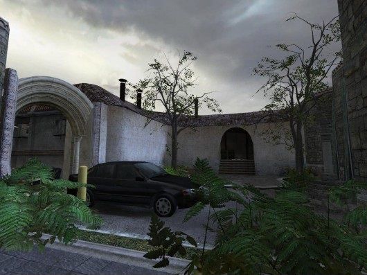
de_sustenance
 CSS
CSS
de_sustenance
by
doodle
Posted 18 years ago2006-03-25 22:23:15 UTC •
Completed •
Counter-Strike: Source
- Name
- de_sustenance
- By
-
 doodle
 - Type
- Map
- Engine
- Source
- Game
- Counter-Strike: Source
- Category
- Completed
- Included
- BSP
- Created
- 18 years ago2006-03-25 22:23:15 UTC
- Updated
- 18 years ago2006-04-09 03:48:47 UTC
- Views
- 4354
- Downloads
- 971
- Comments
- 8
- Rating
- 4.00 (3)
- Reviews
- 0
Finally releasing this thing
Thanks to all who critted etc...
Nav included for bots, have a run around
Any new comments would be great...it'd be nice if you also updated at that site you keep linking to satchmo
Thanks to all who critted etc...
Nav included for bots, have a run around
Pre-easter update
Quick update, basically did everything metnioned in here, cubemaps are fuxed due to valve update...if I wanted them to work right I couldn't bspzip/use my bushes that react to light...I don't want glowing bushes
Any new comments would be great...it'd be nice if you also updated at that site you keep linking to satchmo
8 Comments
You must log in to post a comment. You can login or register a new account.


lol nah i will review properly when i get home
I like the underwater bombsite. It makes interesting gameplay. And it's fun to see the blinking red light of the bomb under murky water.
I also enjoyed the unique look of the map. It has a style of its own, instead of just borrowing the theme from the stock maps. There are enough details to make the map good-looking and realistic.
However, I wish the prop_physics were made into prop_physics_multiplayer. The constant bumping of the phys objects is a distraction during a fire-fight.
I posted this map at CStrike Planet.
http://www.cstrike-planet.com/maps/975
The map has a bit of a maze-like feeling to it, so I kind of miss a reference point telling me where I am in the map (maybe a tall building, something in the skybox etc)
I dont know if it's only me, but some places seem to have absolutely no cubemaps in them! (wooden floors in a dark part of the map)
I also forgot to mention that the framerate is a bit low for this map. Even though it's not a large map, sometimes the framerates dip to the 30's for me (with no one playing). For reference, I am usually in the 100's for the official Turtle Rock maps.
Perhaps it could be better optimized too?
http://www.cstrike-planet.com/maps/975#comments