The Whole Half-Life
TWHL
Forums
Wiki
Vault
Competitions
Discord
More...
Journals
News
Polls
Members
Go
Go
Login
Email or Username
Password
Remember Me
Login
Forgot Your Password?
Register
The Whole Half-Life
Level design resources for GoldSource, Source, and beyond
Featured mod:
TWHL Tower
by
TWHL members
Forums
Wiki
Vault
Competitions
Discord
Community
Journals
News
Polls
Members
Login/Register
Remember Me
Login
Forgot Your Password?
New user?
Create an account
Grid
Vault
View Vault Item
HLDM
Grid by
Ag3nt-X
Posted
18 years ago
2006-05-14 10:50:23 UTC
• Completed • Half-Life: Deathmatch
Loading...
Name
Grid
By
Ag3nt-X
Type
Map
Engine
Goldsource
Game
Half-Life: Deathmatch
Category
Completed
Included
BSP
Created
18 years ago
2006-05-14 10:50:23 UTC
Updated
18 years ago
2006-05-14 10:50:23 UTC
Views
2336
Downloads
820
Comments
4
Rating
3.00 (1)
Reviews
0
License: All Rights Reserved
Download (93.16kb)
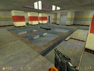
This is a small deathmatch map that can play with 20 player (I recomend you to play with 12 player because the map will lag) based on a Perfect Dark (nintendo 64 game) map called Grid.
4 Comments
Xyos212
Commented
18 years ago
2006-05-14 15:20:21 UTC
Comment #11847
Aww I remember that level! Awsomeness! Downloading now....
Jax
Commented
18 years ago
2006-05-15 03:49:40 UTC
Comment #11857
Purely because that was an awesome DM map on PD I will download this one...
Xyos212
Commented
18 years ago
2006-05-15 11:48:40 UTC
Comment #11862
Was it really that small? I cant remember....
Well on to the map.
Pro's: Good recreation. Matches the map.
Clean texturing, no mismatches, or stretches too obvious
Cons:Blocky, and dull. You could of added more architexture designs to the walls. ITs all too plain.
I give it a 2.5 stars
rowleybob
Commented
18 years ago
2006-05-15 14:05:23 UTC
Comment #11869
Very tight, and very blocky, but cleanly assembled and textured anyway.
Neat layout though, just needs to be bigger imo.
You must log in to post a comment. You can
login
or
register a new account
.
Well on to the map.
Pro's: Good recreation. Matches the map.
Clean texturing, no mismatches, or stretches too obvious
Cons:Blocky, and dull. You could of added more architexture designs to the walls. ITs all too plain.
I give it a 2.5 stars
Neat layout though, just needs to be bigger imo.