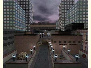
cs_road_ex
 CS
CS
cs_road_ex
by
SuperMechaCow
Posted 18 years ago2006-06-21 13:11:43 UTC •
Completed •
Counter-Strike
- Name
- cs_road_ex
- By
-
 SuperMechaCow
 - Type
- Map
- Engine
- Goldsource
- Game
- Counter-Strike
- Category
- Completed
- Included
- BSP
- Created
- 18 years ago2006-06-21 13:11:43 UTC
- Updated
- 18 years ago2006-06-21 13:11:43 UTC
- Views
- 1832
- Downloads
- 651
- Comments
- 5
- Rating
- 3.00 (1)
- Reviews
- 0
The Road, Extended. I'm not sure if a I ever submitted the first version.
Hostage Rescue map in a terrorist-controlled part of a city. Many bells and whistles to play with here. Tell me what you think.
Hostage Rescue map in a terrorist-controlled part of a city. Many bells and whistles to play with here. Tell me what you think.
5 Comments
You must log in to post a comment. You can login or register a new account.


Gosh darn golly, those r_speeds are the worst I've seen in a while! You could have at least upscaled some of the textures, as that would have helped considerably. As far as I'm concerned, 2500 w_polys is simply unnacceptable, and you can't hope to be able to play this without lag.
On the other hand, it's still a fairly well constructed map. Your architecture was a little blocky, but some places like the tunnels looked like more time was spent on them.
There were plenty of small details in places, but for a map like this, it was still too many. Most indoor areas should generally be avoided in open maps, unless you know you have sufficient view blocking.
One thing that bothered me was the (blah) drivable tank. Those things are just way too glitchy. In my opinion, they should be left out of every map except those that were specifically designed to compensate for their... considerable suckyness.
Fairly nice job in places here, but not enough to make up for the downfalls.
2.5 stars, but I can only give you three.
I'm not sure if it's just my machine or what. I've played the previous version on my ownserver many times, and noone once complained of lag. Perhaps the new additions made it worse, and I'm just not able to notice.
A lot of small crap I was too frustrated to deal with. You have to imagine I have been working onthis map for two years. I started with very crappy architecture and as I grew I went on an ellaboration spree.
The basement I even held back on, as I even thought to myself "This seriously looks like source, and there's no way HL can handle this." At one point I had pushable boxes in the warehouse, which were later removed when they showed to serve no gameplay purpose and I was over my limit of 512 precachable entities.
I will look into CS:S mapping.
Really cool urban environment, though it's so huge, it would take me 20 times playing it to get a good handle on the layout, and explore all areas. Too big and to counfusing of a layout would be my biggest complaint. (I don't like big maps, so I'd consider myself a bit bias in this area)
That said you have lots of superb detail paced in this map, and interesting/creative areas like those big underground tunnels--lighting looked great down there to btw--, the sewers, and the buildings inside and out. Giant area + tons of detailed architecture = gargantuan wpolys... but I'm sure you well aware of this
So while it's not the most playable map in the world, this map still shows you have a great command of brushwork, ambience--nice ambience and trigger ambients btw too!!!--, and ligthing.
Misc gripes:
-scale on that nice momentary button/dial was gigantically huge, but it was so cool, I didn't care much
-lots of doors that didn't open... another pet peeve of mine
-Some intersecting brushes with the glass on the windows at the "bus station" --that was also a sweet area
Beautiful work!
^_^