De_etape
 CSS
CSS
De_etape
by
doodle
Posted 18 years ago2006-07-14 03:20:19 UTC •
Completed •
Counter-Strike: Source
- Name
- De_etape
- By
-
 doodle
 - Type
- Map
- Engine
- Source
- Game
- Counter-Strike: Source
- Category
- Completed
- Included
- BSP
- Created
- 18 years ago2006-07-14 03:20:19 UTC
- Updated
- 18 years ago2006-07-14 03:20:19 UTC
- Views
- 3322
- Downloads
- 1027
- Comments
- 3
- Rating
- 5.00 (2)
- Reviews
- 0
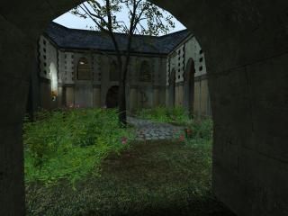
Those terrorists are at it again, this time aiming to destroy the grand courtyards of this castle. The Counter-Terrorists have had an anonymous tip and have been sent in to investigate.
This map is finally at a releasable stage, enjoy.
Find out more information/more screens here: http://www.rabid-monkey.com/~dewdle/galleryetape.htm
This map is finally at a releasable stage, enjoy.
Find out more information/more screens here: http://www.rabid-monkey.com/~dewdle/galleryetape.htm
3 Comments
You must log in to post a comment. You can login or register a new account.


However, some of the halls seem either too long or too empty to justify their existence. Sometimes lateral doors aren't enough to break the wall monotony.
Props do their job well again, and the plant-filled courtyard with the bombsite is the best looking part of the map. Some floor transitions from grass to wood look really strange as they are at the same height.
Other than that, the map looks highly playable and the layout has interesting spots and no major flaws.
(the bright desert sky didn't fit with the lighting!)
Some halls were too plain, but how interesting can halls get? I liked the doors in some of the halls that were "nooked" away. Very unique. The courtyard had some very nice brushwork too.
Some stair rails looked bad though. Rails dont slope on the same incline as the stairs. They are vertical and follow with the stairs.
Even though it has its problems, I can still see the work that went into it. The problems it has are so small they were barely worth mentioning.
Its nice to see custom content and props in a map. (BTW I believe those were custom props right? (CHairs) or am I crazy?)
I give it a 5 out of 5. It gets what it deserves.
I loved the outdoor areas in this map. They were very nicely detailed with a good combination of props and brushwork. My main gripe (as you are aware) are the hallways which essentially don't make any sense whatsoever. Having said that though, there's something rather fun about the layout - it's a quick and dirty map designed for some hectic rounds of CS:S.
If you were to extend the map further, I'd probably add some ambient sound and a 3D skybox. 4 1/2 from me, which gets elevated to 5.