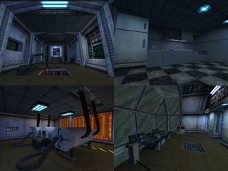
It's a small spaceship of some sort. I Hope it complies to the rules of the compo, because I might have put in some textures from Blue Shift or Opposing Force by mistake.
Commented 18 years ago2006-07-21 16:39:02 UTCComment #12614
I think that guy may be jimmi. He's been low-rating other people's maps too for no apparent reason.
Excellent stuff srry! You should make a nice little DM out of this!
I loved the bridge, the sleeping quarters, and the engine room the best. Pretty much superb detail throughout, and nice use of the original textures. Above all, very nice detailing brushwork accents the entire map as well.
This ship reminds me of the Nostromo from Alien, The Supernova spaceship, and some NS maps too. Very, Very well done!
Commented 18 years ago2006-07-22 21:07:29 UTCComment #12631
the map over all had its neat little accents throughout all of it. I liked the way it seemed kind of realy like a space ship, the big window room was kewl, and a few areas like the pipes and stuff show that your pretty good with shaping stuff,possibly using vm. In my opinion the hallways may have been just a bit small, definetly needing to be widened if made into a dm map"also if made into a dm map rooms would nead to be connected with more than just one hall each but enough about that". The elivator was kind of tiny and the buttons were on the outside of it...?unless it was supposed to seam to be ment for transporting stuff. Major turn off lol->there were sooooo many buttons but none of them did anything, common , im in a space ship, I should be able to contole lots of stuff.. It seams that you went into quite a bit of detail with a lot of the map but imo in some places such as control panels etc. you could have gone into more. maybe i just am saying that because i tested the map after playing cs sourse for the first time.
Commented 18 years ago2006-07-22 21:26:35 UTCComment #12632
Just a few things to clear up:
1 - The elevator was just meant for transporting small items from the rear storage area to the second floor.
2 - I'm not planning on making this into a DM map, but I might use the same theme to make another one with. They were intended to have a small, cramped feeling to them.
3 - The buttons don't do anything because the map wasn't made for that, it was made for a minicompo where you had to detail everything. If I'd had more time, I might have made some of them do something.
Commented 18 years ago2006-07-22 21:28:50 UTCComment #12633
EDIT:
2 - I'm not planning on making this into a DM map, but I might use the same theme to make another one with. The hallways were intended to have a small, cramped feeling to them.
Commented 17 years ago2006-12-07 05:16:07 UTCComment #13621
My my, thanks for all the praise. I never expected to get as much recognition for this as I have.
It's really strange how well it turned out, because I only had a very vague idea of what I wanted the map to be when I was working on it.
I started out with a hallway inspired by Quake 4 and Doom 3 maps, and I decided from there it would look best as a spaceship. Once I had defined what the length and width would be, I was really restricted on what I could build. If it hadn't been for the small rooms that were required, I would have never been able to cram as much detail in as I did, because I would be more focused on spreading it throughout the map.
I guess sometimes lack of direction actually IS a good thing!
Commented 17 years ago2006-12-07 05:25:17 UTCComment #13622
One more thing, in case anybody is interested:
I was building the whole map for the sole purpose of looking good, so I detailed everything as I went, rather than adding it in later. The architecture of the map was built to accomodate detail, not the other way around, so there wasn't any point where there was just a base map. I pretty much did one room at a time, which gave me quite a few problems, but somehow it all connected togethor in the end.
Commented 17 years ago2007-04-17 23:43:19 UTCComment #14645
Excellent attention to detail. As you say, a little small for DM, but it was made for the competition and it is a real pleasure to look at. Dam good job! Thanks!
Commented 15 years ago2009-05-04 20:31:17 UTCComment #17479
Great map, I loved the detail (how did I not do this when I downloaded it?) Even though it's got nothing going for it other than the awsome detail, You can make your own fun with impulse 101 and a little imagination.
Commented 13 years ago2011-01-10 12:28:23 UTCComment #18722
+Superb detailing and styling in places +great use of the old GoldSrc textures in most of it +visually interesting and consistently well detailed.
I know you will most likely never revamp this map, but it would have been nice to see: -some of those ungodly horrible original HL textures(the carpeting, monitors, etc) with some nicer skins -a warp vortex or a "zooming" lightspeed starscape from the cockpit canopy. -some 2001-style sounds or radio chatter also in the cockpit would be golden =) -use of sprites to give some of the instrumentation a little more life/flair. -might have been nice to be able to send pushable containers into that little service elevator, and have some clear parts so you could watch it "ride up" to the next floor =)
All in all, a very well made, interesting spaceship! =) *****
- Muzz
Downloading... will play/rate soon.
Excellent stuff srry! You should make a nice little DM out of this!
I loved the bridge, the sleeping quarters, and the engine room the best. Pretty much superb detail throughout, and nice use of the original textures. Above all, very nice detailing brushwork accents the entire map as well.
This ship reminds me of the Nostromo from Alien, The Supernova spaceship, and some NS maps too. Very, Very well done!
1 - The elevator was just meant for transporting small items from the rear storage area to the second floor.
2 - I'm not planning on making this into a DM map, but I might use the same theme to make another one with. They were intended to have a small, cramped feeling to them.
3 - The buttons don't do anything because the map wasn't made for that, it was made for a minicompo where you had to detail everything. If I'd had more time, I might have made some of them do something.
2 - I'm not planning on making this into a DM map, but I might use the same theme to make another one with. The hallways were intended to have a small, cramped feeling to them.
That bridge are very nice...
The couch however was bit... boring. But the bridge was awesome!
I just played it again, and I'm still completely astounded by the detail in your brushwork for this. It really looks beautiful!!1
Simply some of the best attention to detail I've ever seen in a Half-Life map, period. Also, fantastic use of the original textures.
Sorry I didn't rate before.
*win
*****
It's really strange how well it turned out, because I only had a very vague idea of what I wanted the map to be when I was working on it.
I started out with a hallway inspired by Quake 4 and Doom 3 maps, and I decided from there it would look best as a spaceship. Once I had defined what the length and width would be, I was really restricted on what I could build. If it hadn't been for the small rooms that were required, I would have never been able to cram as much detail in as I did, because I would be more focused on spreading it throughout the map.
I guess sometimes lack of direction actually IS a good thing!
I was building the whole map for the sole purpose of looking good, so I detailed everything as I went, rather than adding it in later. The architecture of the map was built to accomodate detail, not the other way around, so there wasn't any point where there was just a base map. I pretty much did one room at a time, which gave me quite a few problems, but somehow it all connected togethor in the end.
Anyway this is a crazy cool map. I love how everything just seems to fit the theme, and i really like that sofa by the stairs. VERY creative.
More people need to make entire maps with as much detail as this.
Half-Life would be so much more enjoyable.
5 stars
What can I say that hasn't already been said? Excellent work.
Even though it's got nothing going for it other than the awsome detail, You can make your own fun with impulse 101 and a little imagination.
+great use of the old GoldSrc textures in most of it
+visually interesting and consistently well detailed.
I know you will most likely never revamp this map, but it would have been nice to see:
-some of those ungodly horrible original HL textures(the carpeting, monitors, etc) with some nicer skins
-a warp vortex or a "zooming" lightspeed starscape from the cockpit canopy.
-some 2001-style sounds or radio chatter also in the cockpit would be golden =)
-use of sprites to give some of the instrumentation a little more life/flair.
-might have been nice to be able to send pushable containers into that little service elevator, and have some clear parts so you could watch it "ride up" to the next floor =)
All in all, a very well made, interesting spaceship! =)
*****