Scoutzknivez27
 CS
CS
Scoutzknivez27
by
swiftd27
Posted 18 years ago2006-08-07 23:08:02 UTC •
Completed •
Counter-Strike
In cz my favorite weapon is the scout and one of my favorite maps is scoutzknivez,but there were a few anoying things about the regular scoutzknivez that really defeated the purpose of the scout such as:
-the map is only a couple thousand units wide.
-and when you run out of spawn ur likely to get shot in the head.
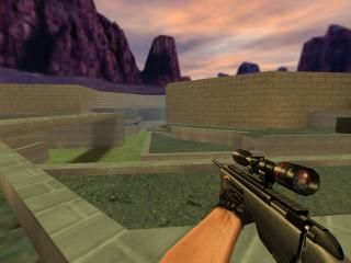
So i desided to create a map similar to scoutzknivez but also doesnt have these problems, and i desided to call it scoutzknivez27 (surpise ).every1 starts wit nade, scout with full ammo,armour, and a knife.there are 2 spawns for t and ct. should be played with gravity at 200 to 250.
note- the architecture is obveiosly very blocky but thats just for the sake of r_speeds.
Constructive criticism welcome.
-the map is only a couple thousand units wide.
-and when you run out of spawn ur likely to get shot in the head.
So i desided to create a map similar to scoutzknivez but also doesnt have these problems, and i desided to call it scoutzknivez27 (surpise
 ).every1 starts wit nade, scout with full ammo,armour, and a knife.there are 2 spawns for t and ct. should be played with gravity at 200 to 250.
note- the architecture is obveiosly very blocky but thats just for the sake of r_speeds.
Constructive criticism welcome.
11 Comments
You must log in to post a comment. You can login or register a new account.


on another note i just found out that i forgot to include the cz office wad, so ima update the map in like 20 minutes...
Also, you used a brick texture (the grey one) as a floor textures. Have you ever seen a wall texture used as a floor texture? My advice to you is: choose the correct textures for walls, floors, ceilings and what not.
I have even seen maps with the red firedoor texture used as a floor texture. Wrong wrong wrong.
the grey part that im standing on in the screenie is ment to look like an extension of the wall above the floor...
Shift + A, select the top of your wall at rotate it properly.
I like the wide-open nature of the map, though, there are quite a few "nooks and crannies" to hide in and around. It would be very interesting to see how this plays on a server.
-Texturing is adequete but bland
-Lighting is very bland.
-I realize it's a SKZ map, but more of a unique theme and props would make this map much better.
Neat stuff for a ScoutzKnivez map:)
so u can tell wes to go home because this one was all me lolz