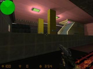
fun_hkmtr
This is are map that consult from the Hongkong MTR
You will note some of the part of this map are non-finished
i don't know where i should submit this map
because i lost my rmf file , i can finish it
so i put in the "completed maps" section
You will note some of the part of this map are non-finished
i don't know where i should submit this map
because i lost my rmf file , i can finish it
so i put in the "completed maps" section
3 Comments
You must log in to post a comment. You can login or register a new account.

 CS
CS


Map looks alright though, im not really having a go at you.
Just the world in general.
That said this map is full of errors that distract from all the good stuff, among them:
--HOM(hall of mirrors) effect where the player can see outside world
--1-unit spaces between brushes that should be flush toghether
--Textrues strangely alingned in places
--Spawn areas very nondescript(boring, bland)
--no sounds at all
Neat map anyway, hope you finish it someday
- I saw your other maps, and It seens that you like to make subways and train maps.
- Your maps have a nice layout and estrategicaly well done.
- The train is very shitty. the walls are floating and you should fix that.
- At the tunnel end you can see outside the world.
- The subways stairs are floating.
- You must reduce to near 32 points from ground the seats at pillars.
- Add more junk at your maps, like phones, coke machines etc...
But It still a good map. Keep mapping! I see an beautiful future for your maps. :).