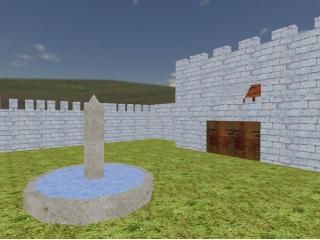
cs_castlefight
 CS
CS
cs_castlefight
by
Crazylikeafox
Posted 18 years ago2006-09-26 17:38:53 UTC •
Completed •
Counter-Strike
- Name
- cs_castlefight
- By
-
 Crazylikeafox
 - Type
- Map
- Engine
- Goldsource
- Game
- Counter-Strike
- Category
- Completed
- Included
- BSP
- Created
- 18 years ago2006-09-26 17:38:53 UTC
- Updated
- 18 years ago2006-09-26 17:38:53 UTC
- Views
- 1902
- Downloads
- 689
- Comments
- 16
- Reviews
- 0
my first map...i know its bad but i would be grateful if you downloaded it and tried it!
16 Comments
You must log in to post a comment. You can login or register a new account.


for a first map you used a variety of things
archs
doors
water
wedges
clipped area
i thought that was good... rather than the aaatrigger box with a light in spawn which many people start out with (unless u did that and just didnt upload that map)
anyway...
the items i suggest improving on are
fullbright
vary your architecture its very blocky (i no its ur first map but im just saying)
i dont think that tank fits in with the castle theme at all
keep mapping you have a lot of potential
The biggest flaw, i think, is of course the full-bright. Add lights, run RAD.
The textures are repetative, but suit the theme, and there are some nice examples of non-blocky brushwork.. (some.)
I make a point not to rate first maps, but if i was going to, this would get 3 stars. Good work, now map something amazing
oh and the reason i used full bright was because whenever i add lights to a map there's always dark areas and i absolutely HATE it! its just some weird thing about me but I'm like...obsessive compulsive with this stuff but my next map will not have full bright
That may be kinda confusing.. A better way of putting it is 'Place your light_environment a little below your top sky brush.'
I'll also say that even though I havent played it, for your first map it doesn't look that bad but having it be fullbright just makes you look lazy to some people
Try to add lights to the next one tho (my first couple maps were fullbright too)!!...I'd recommend the textlights tutorial, here:
https://twhl.info/wiki/page/Tutorial%3A_Texture_Lighting
Atom's tutorial on lighting is also pretty good:
Tutorial: Light