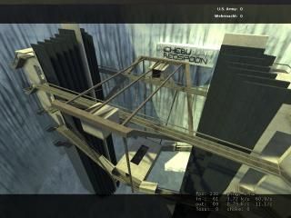
dod_spires_v1
 DODS
DODS
dod_spires_v1
by
ichebu
Posted 18 years ago2006-10-10 19:00:06 UTC •
Completed •
Day of Defeat: Source
- Name
- dod_spires_v1
- By
-
 ichebu
 - Type
- Map
- Engine
- Source
- Game
- Day of Defeat: Source
- Category
- Completed
- Included
- BSP
- Created
- 18 years ago2006-10-10 19:00:06 UTC
- Updated
- 18 years ago2006-10-10 19:17:19 UTC
- Views
- 1376
- Downloads
- 514
- Comments
- 5
- Rating
- 2.00 (2)
- Reviews
- 0
This map was originaly intended for Rifles and Snipers only, but play however you wish. There are 2 hidden teleports. 1 will transport you to the name sign, the other to the ground. Can you find them? Currently playing at: 8.6.9.10:27015
5 Comments
You must log in to post a comment. You can login or register a new account.


Here is the review:
The map is ok, and textured badly. It does not match the DOD theme, and its just brushwork.
Your brushwork looks like HL1. You have a huge hollowed cylinder surrounding the map. You should of used displacements in a 3d skybox for mountains.
There about 3 textures in the map. THe blue wall, the concrete white, and the metal/grating. All objects (wall, floor, ceiling) are the same texture. Ceilings/floors are different from walls.
In the towers (which you obviously made 1, then copied) THey are completely empty. NOTHING in them. No architecture inside at all.
Move ropes would of made a great difference criss crossing from spire to spire.
Props are essential in source mapping. Brushwork alone does not cut it. THey add a more detailed realistic feel.
No prop physics either to get blown around...
NO cubemaps either
This looks and feels like a HL1 map. THe only thing that makes it source is Valves lighting and texture detail.
I seriously recommend going back and fixing all that I mentioned.
Also, not many people have DODS on this site, so dont expect alot of downloads
What the hell are you ON!? Did you even download the map?
Anyway...
pros:
.....?
Cons:
Texturing is....bad. Like Xyos said, there is like three textures throughout the whole map.
There are NO PROPS. Each room is so bland and repetative.
No displacements at all.
No ambient sounds.
Map inside a huge cylinder.
No detail whatsoever.
Again with your name in the huge print. That is "noob" written all over it. Tacky!
Make your maps, make sense. It is unlikely there will ever be a perfectly even cylinder which inside there is a bridge that leads nowhere.
All in all 2 stars. Use these tips to further improve your next map.