Two

Counter-Strike CS
Two by andman
Posted 17 years ago2006-10-18 10:13:04 UTC • Unfinished • Counter-Strike
Loading...
Screenshot Thumbnail
Name
Two
By
andman andman
Type
Map
Engine
Goldsource
Game
Counter-Strike
Category
Unfinished
Included
BSP, RMF/VMF
Created
17 years ago2006-10-18 10:13:04 UTC
Updated
17 years ago2006-10-19 03:20:32 UTC
Views
1637
Downloads
489
Comments
20
Rating
2.00 (5)
full star full star empty star empty star empty star Download

Two was a practice map. People liked it so I thought you might like it too. Please leave feedback!

20 Comments

Commented 17 years ago2006-10-18 11:03:16 UTC Comment #13196
Fullbright!

You have:

1. A leak.
or:
2. No light source (point/texture)

Get rid of the brightness please. It makes your map so much better.
Commented 17 years ago2006-10-18 12:10:20 UTC Comment #13197
Maps without lights dont belong in the completed maps vault
Commented 17 years ago2006-10-19 03:25:31 UTC Comment #13200
Poor textures.
a few flaws.

Reasonable game play.
can be quite intersting with a combination of snipers or rifles.

nice Idea.
this could be made much better with a bit of work.
Pretty good for your first map!
Commented 17 years ago2006-10-19 03:29:13 UTC Comment #13201
map had a light and no leaks. I re-uploaded it with some more files, maybe that will fix it!
Commented 17 years ago2006-10-19 06:26:10 UTC Comment #13203
3) it could be that you didn't run RAD

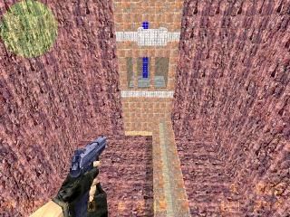
4) is that a BLUE ladder i see in the screenshot?
Commented 17 years ago2006-10-19 07:29:13 UTC Comment #13204
Hello, developers friend here.

The ladder is blue because the screenshot was taken on a computer without a GFX card which means it was using software rendering. It has been tested with a computer using openGL and the ladder is normal.

What do people that have played it think? Hows gameplay?
Commented 17 years ago2006-10-19 08:39:37 UTC Comment #13205
Looking at the screenshot I already know that map isn't worth 3 stars. There is definitely some Bias here. But I'll check it out later.
Commented 17 years ago2006-10-19 09:47:40 UTC Comment #13207
Well, if that map is fullbright, really do fix it.
Also, the texturing is repetive and this certainly is the first time I see a box made out of rocks..

Gameplay?
Well, i'll be honest, I haven't played but it just looks like a killbox to me..

Anyway, I would get a better screenshot were the ladder is normal and the map isn't fullbright, this way, people will actually download your map.

Good luck.
Commented 17 years ago2006-10-19 09:47:44 UTC Comment #13208
just do what they say and keep up the good work.
Commented 17 years ago2006-10-19 15:18:32 UTC Comment #13211
QUOTE FROM MCMITCHO
"and keep up the good work"
What are you on!? The whole concept ofr reviewing a persons map is to be completely honest and try to help them to make their next map better. This map is far from "good work."

QUOTE FROM CRAZYBOY11
"this could be made much better with a bit of work.
Pretty good for your first map!"

He never said it was his first map. He said it was a test map. Which means it is no where near worth 3 Stars. Also it would take more than a bit of work.

Definitely Bias in here.

Just downloaded it.

Pros:
None

Cons:
Full Bright
Horrible Texturing
Horrible Layout
NO Detail
Bad FPS (How do you get Bad FPS on this map?)
NOTE: I do not in anyway want to bash your map. I am simply more direct in my reviewing. I say it like it is and don't make it sound like something awesome. And I would hope all of you do the same for my maps as well, because useless information and critisizm isn't worth having.
Commented 17 years ago2006-10-19 15:20:02 UTC Comment #13212
Did you see blue ladders in HL1 when you played in software mode? Nope. So it's not normal, and you should really fix it.

And you have to have SOME kind of video card, whether it's integrated or not.
Commented 17 years ago2006-10-20 09:35:24 UTC Comment #13221
"Maps without lights dont belong in the completed maps vault"

totally agree. The screenshot btw looks horrible.
Commented 17 years ago2006-10-20 20:39:23 UTC Comment #13224
"Did you see blue ladders in HL1 when you played in software mode? Nope. So it's not normal, and you should really fix it."

It's a bug on those computers. All maps, even the default ones such as cs_office, de_dust etc have blue ladders on those computers.

However I'm home now for a week so I'll try and have a go at this hammer!
Commented 17 years ago2006-10-22 01:34:27 UTC Comment #13264
WHAT THE FUCK????
Commented 17 years ago2006-10-23 05:56:41 UTC Comment #13311
I will be posting an updated version of this map on behalf of andman later on today hopefully.
Commented 17 years ago2006-10-24 09:01:35 UTC Comment #13317
Hit a snag with it. Dynamic lighting will be included in the next attempt (I never used it before, seemed like too much hard work), as well as a skyscrape (or whatever you call it) where there is a better looking surrounding.
Commented 17 years ago2006-10-26 02:06:18 UTC Comment #13336
lol dude, uhhh cs 1.6 doesnt have dynamic lighting; and are you trying to say you're going to add a skybox? wow, youre giving us a sky in 1.6 (lol here we are, source mappers working for weeks on the damn 3d skyboxes themselves, and this guys is adding a sky texture to the top of his box!! omg) keep going dude.
Commented 17 years ago2006-10-27 14:51:21 UTC Comment #13351
CS 1.6 does have dynamic lighting, like cs_office. CT spawn is darker than outside, that is dynamic lighting if I am not mistaken.

As for the sky thing, the amker does not know what you mean. What he has done what is in the envirnment tutorial found on this website which says, create a box around the edges, apply the texture "sky", opened the map properties and set a sky map.

-Jack
Commented 17 years ago2006-10-28 21:27:20 UTC Comment #13365
Obviously this is one of your first maps, so there is no point in going too far in depth about this--not that there is so much to talk about!

Your map has no lights. When I first started mapping all my maps were fullbright too, and I thought they looked so good. Well let me tell you your map will look a 100 times better with lights.

Instead of the flat textures, you get nice degrees of shadow and light/dark areas that make your map sooo much more realistic.

Also the map is quite blocky with no fine detail work. While technically ok, this is very boring and also very unrealistic.

All this said, I like the basic layout of your map, and there are no major errors. Play more maps, read tutorials, use reference pictures, and of course keep mapping... and you'll improve quickly :)
Commented 17 years ago2006-11-01 12:30:49 UTC Comment #13397
This doesnt deserve 3 stars

You must log in to post a comment. You can login or register a new account.