de_littlegarden
 CS
CS
Loading...

- Name
- de_littlegarden
- By
-
 flnd
flnd - Type
- Map
- Engine
- Goldsource
- Game
- Counter-Strike
- Category
- Completed
- Included
- BSP
- Created
- 17 years ago2007-03-06 07:43:37 UTC
- Updated
- 17 years ago2007-04-02 14:37:47 UTC
- Views
- 1228
- Downloads
- 477
- Comments
- 1
- Rating
- 4.00 (1)
- Reviews
- 0


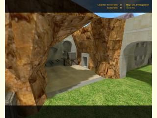
A map. For CS. A map that I've worked with for some months, and now feel like finnishing. Though I don't know if I'm happy with it or not, cuz I always find new stuff to change or add, but enough is enough.
The hills for example could be done in various different ways, but when I start vertex manipulating the r_speeds tend to go nuts. So therefore this time I'll stick to the way they are.
Enjoy!
//Flendel
The hills for example could be done in various different ways, but when I start vertex manipulating the r_speeds tend to go nuts. So therefore this time I'll stick to the way they are.
Enjoy!
//Flendel
1 Comment
You must log in to post a comment. You can login or register a new account.
+ Architecture. Good work with that. even if the small colourful corridors are blocky - the vast majority of the map had very nice architecture. From the open areas, that had nice rounded corners and sweet cliffs, to the tunnels, that were awesomely detailed - it was all clean & pleasant. The brush signs on the walls were a nice touch too.
+ Layout. I haven't tested the map with bots/other players, but I can tell, that this will play good. Lots of multiple paths, that connect with each other and should provide the map with some fast-paced, dynamic gameplay.
+/- Detail. The signs and tunnels were detailed, although I've found the outside walls quite bland and boring. Some kinda trim, or some other details, like windows would help a lot.
+/- Lighting. It was alright and clean, although a bit boring. If the contrast between areas is so big in your map - so should be the lighting.
- Texturing. I've failed to catch the theme of the map. It was very mixed up, having some industrial-ish parts (the dark grey tunnels), some sandy parts, combined with green and an interior, that looked, like a hotel. It just didn't look too logic together. The crates just looked weird in a setting like that. Unless you wanted the theme to be fantasy - I'd suggest working on it a bit more.
- Ambience. None found. Add some.
Overall - the map was quite interesting. Some flaws with texturing and lighting, although overall - it was nice.
I'd give 3,5*, so that rounds up to 4.