Core_Xplosion v2
 HLDM
HLDM

Core_Xplosion v2
by
Skals
Posted 17 years ago2007-05-15 08:18:31 UTC •
Completed •
Half-Life: Deathmatch
Loading...

- Name
- Core_Xplosion v2
- By
-
 Skals
Skals - Type
- Map
- Engine
- Goldsource
- Game
- Half-Life: Deathmatch
- Category
- Completed
- Included
- BSP
- Created
- 17 years ago2007-05-15 08:18:31 UTC
- Updated
- 17 years ago2007-05-16 14:42:23 UTC
- Views
- 2875
- Downloads
- 867
- Comments
- 8
- Rating
- 1.00 (1)
- Reviews
- 0


The new, much better version.
8 Comments
You must log in to post a comment. You can login or register a new account.
- Still the same badly alligned brush and texture work
- FIRE DOOR textures mirrorred.
- Light texture applied to all sides of the light fixtures
- You brushboxed your map. Bad.
Work on these.
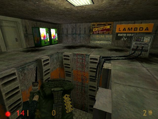
well i fixed the textures of them 'things' in the bottom of the generals room.
i changed few rooms to make em cool.
i made holes to make it look like explosions.
i changed the bit from 2 minimaids to 1 coke 1 mini maid.
i added sounds to door.
- Poor texturing
- Poor lighting
- Small, and not in a good way. Uninteresting layout.
- Laggy. For a map this small, it's really bad. This is mostly because of your inefficient brushwork. You've tried to make nice indentations in the floor, but it's done all wrong. For example, the r_speeds are 900-1200 while looking straight down at just one tile of the floor where you've done this. And you've also just made one pattern, and copied and pasted it several times. This could easily be OK, in a large map, but in such confined spaces its boring to see the same obvious pattern in the floor every 5 seconds.
I really struggled to find anything nice to say about this map - but I always try (these days) to say at least one thing positive about any map.
But all I could come up with, is that this map is slightly better than the very first thing I ever made the first time I ever opened Hammer -
which no-one is ever going to see.
Practise. A lot. And do some reading on how to make your brushwork not make the engine cry in horror. There's some tutorials on this site, and also in many other places on the good old intarweb.
Now onto the map:
- Small, combat cramped
- The cracked floor seems a bit wierd to me.
- Fire doors backwards
But for a first release its pretty good