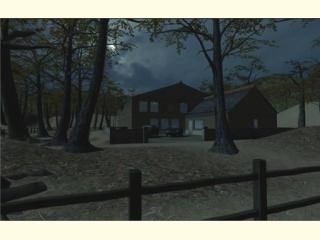
cs_lilhouse_v2

Counter-Strike: Source CSS
cs_lilhouse_v2 by Playbus
Posted 17 years ago2007-07-20 15:55:41 UTC • Completed • Counter-Strike: Source
Loading...
Screenshot Thumbnail
Name
cs_lilhouse_v2
By
Playbus Playbus
Type
Map
Engine
Source
Game
Counter-Strike: Source
Category
Completed
Included
BSP
Created
17 years ago2007-07-20 15:55:41 UTC
Updated
17 years ago2007-07-20 16:51:57 UTC
Views
3814
Downloads
933
Comments
7
Rating
3.00 (1)
Reviews
0
full star full star full star empty star empty star Download

I made a new version of my old map. Bots don't work too well. I think it should be fun for players though.

It's a lot tidier than the original. :D

7 Comments

Commented 17 years ago2007-07-20 17:19:48 UTC Comment #15392
looks pretty sweet, ill look at tonight ;)
Commented 17 years ago2007-07-20 20:20:22 UTC Comment #15393
Well, I've never really been into Source maps, but this one looks really good from the screenshot.
Commented 17 years ago2007-07-21 05:59:36 UTC Comment #15396
For me, making this map was really an exercise. I needed to practise 2 thing - making darker ambient lighting which still works, and also keeping my brushwork and texturing as neat as possible.

I want to get the lighting even darker, but it's hard to do without ruining the gameplay.
Commented 17 years ago2007-07-21 08:21:09 UTC Comment #15399
Hey, I remember lilhouse.
Lookin' good. downloads
Commented 17 years ago2007-07-21 08:57:09 UTC Comment #15400
Oops. It seems the trees aren't solid. doh

I'll fix that as soon as I get time.
Commented 17 years ago2007-07-27 17:36:22 UTC Comment #15428
Yeah, make sure the prop_ type correlate to the model's compatibility.
Commented 14 years ago2010-03-16 18:21:02 UTC Comment #17987
Just want to start by saying i LOVE maps of residential homes! My first impression is that this looks VERY well-constructed.

--Very dark map (which isn't a problem by itself) but it does not match the lighting of the surrounding terrain.
-scale and proportions are a bit off inside
-detail is a bit sparse, could use much more
++layout of house pretty nice minus the scale of some rooms
+surrounding hills look pretty good
-none of the trees have clipping.

all and all pretty mediocre, but still, nice work mate!

You must log in to post a comment. You can login or register a new account.