dm_cliff
 HLDM
HLDM

dm_cliff
by
Tetsu0
Posted 17 years ago2007-07-28 18:34:02 UTC •
Completed •
Half-Life: Deathmatch
Loading...
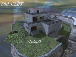


Dm_cliff FINAL
Inspiration was drawn from being bored, and wanting fast gameplay. I also draw a lot of it from the textures i use.
Fast-Paced (hopefully) game-play balances out with a lot of vertical game-play and there is a good balance of both open areas, and tighter indoor areas.
Meant for a smaller server, there are only 12 spawn points.
First release date: July 28, 2007
Second release date: July 29, 2007
Additions: Sound and fade when player falls of cliff. Larger cliffs. Made crossbow more accessible. Ambient generics spread throughout map. Cliffs higher. Stone wall flows better.
Third release date: July 29, 2007
Additions: Added windows, Railings, pond with fountain. Decals
Moved to unfinished Vault
August 8th - Moved back to completed vault. Added arch, floating platforms, changed sky, better ambience, better lighting, full compile, more weapons
24 Comments
You must log in to post a comment. You can login or register a new account.
One thing is the curved wall... it ends far too quickly in my opinion. Just cuts off right there at the edge of the island. You did one end nice, but the other was just a 90 degree corner. It was also kind of disappointing that you couldn't have handled the falling a little better. You just fall about ten feet, hit an invisible wall and splat, you're dead. Pretty unrealistic. The ambient noise was pretty lacking, too. You could have put a generic kind of surreal sound in there, just to give it a bit more atmosphere.
Otherwise though, it fared pretty well. You didn't have much detail other than the nicely made benches, but that's understandable considering the w_polys got to above 1300 in places (maybe some well placed models could have helped here?) generally nice architecture, though. I liked how you put the wood beams on the ceiling inside, and the island itself was well shaped, with plenty of curves. Never a boring or redundant area anywhere, and it's certainly very easy to find your way around.
I felt that river could have been used a bit more, however. Maybe if it was placed better, it could have run underneath the building. That would have been cool, although you were lacking the space to put it in.
Overall, quite good, but could have possibly stood for some improvement and testing before it was released.
+ Texturing went nicely together, though I still say you should have gone with the original 512^2 textures.
+ Overall architecture was pretty good, I especially liked the windows. Mad props on that.
+ Great layout, albeit a might crunched.
+ Nice benches, though they were way too short. Try 20 units high instead of 8.
+/- A very small map, but you covered that so I wasn't really expecting anything bigger.Would be fun with around 4 players, but it might get messy when more players pour in.
+/- The waterfall pushed me off the map way too fast. Slow that down, there's no rush. And the scrolling water inside the water(near the edge) was an obivous bug. Null that bad boy off.
- A lack of any global ambience whatsoever KILLED the feel of the map.
- The harsh shadows don't fit well with the map's theme, try adding a few more bounces to clear that up.
- The cliffs were about 3 inches high. Neds moar hite. At least let the player fall long enough so that he/she can't see the main playing area anymore.
But I liked it. It's a nice, original map. Get the final version done!
I agree with srry, that the "fall to death" distance is too short, but I have no problem with that tbh. The only complain I have about this map, is the inside of the building. Some areas are just too dark. Maybe it's just my dark-ass display, but I have to really turn up the gamma levels to see something - and if I do that, the outside looks washed out. I have no problem with this if I'm running a SP map, but I just hate it, when I get shot down, and don't even know, where the bullet came from.
+ Good Architecture. Not boring, quite interesting.
+ Nice weapon placement.
- No long jump. Decreases strategic gameplay and fun. IMO
- Benches were too small.
+ Great textures.
+Decent Architecture
+A good selection of weapons
-Bad RPG placement. It just too easy to get
-Along with the the RPG comes the place it's in, I camped srry's ass there and pwned him everytime he spawned
-Not big enough
-Because it's not very big, it's very easy to recognize where the spawns always seem to be, and therfore, death on spawn is pretty easy
-/+Lighting, feels a bit odd in some places.
-Falling; the falling sounds are nice to have, but its pretty awkward when a person dies, and then triggers falling sounds (imho). You need to REALLY deepen that fall, it seems to end right where the bottom of the map brushing is. When someone falls and gibs, i can see their gibs fly up. I can also see their drop can thingy laying there.
-/+Weapon placement was a bit bleh on this one. Somethings were just too out in the open, the Tau cannon was pretty easy to get too. And, no spare Tau ammo? =(
+Crossbow location. I stood and watched for minutes as srry tried to reach that edge, it took me one try because I knew how to do it. In other words, it's pretty good. Although its harder to get than the RPG AND the tau cannon.
Needs moar cover. Too many open spaces. More ammo for somethings, and better placement for other items (namely the RPG and Tau Gun).
Overall, it looks pretty good, but plays pretty bad.
So ill start working on that now, wont be an update for a while (not until tomorrow probably) Sorry i wasn't in the server with you guys, got called for an emergency game of baseball.
The shaping of everything was done well.
I can't say anything about weapon/ power-up placement, I haven't played it with others.
The skybox seems weird. Is this a bright map? Or is it a gloomy map? Adding some dark music would justify the current sky.
The RPG is just too much on this map, it should be removed or swapped with the crossbow. Speaking of the crossbow, how do you actually get it?
I'm nitpicking here, this is a great map for 4-6 players. Overall, a good job, just fix the theme and place spawns in nooks.
Nice ambience on the updated version, by the way. It really pulls the map together.
+ Ambience. I think you did well, a lot of people tend to forget it.
One thing I must adress you to, when you fall, you'll get the classic aaaaah scream, but when you fall at the waterfall, you don't hear that.
+/- Architecture. It's decent, I didn't found it anything speceal really, sometimes I actually found it strange. A big cylinder on the roof.....wtf?
I really didn't know what to think about the 'house' tbh. What is it, a house, a villa, some kind of ruin? If it is a house, it certainly doesn't look like it. Also, the pond of water with the fountain looked awfully wrong. I also found the surrounding walls quite short in lenght. I was kinda aspecting a big fall.
+/- Texturing. Overall nice, but I found the texturing of the house kinda bland.
+/- Weapon Placement. I haven't played this with other people, but it's quite easy to notice the crappy RPG placement etc..
- Size. Even tho it's ment for small games, I still think it's rather small.
I really don't see why this is better than the avg deathmatch map, so 3 stars.
I'll DL it and see for myself tho.
After spending a day or 2 in the unfinished vault
downloads
++superb dm layout
+some very nice texturing on most things
+good, varied ambience throughout
+great general design, clean brushwork
+/-nicely detailed but there is room for more
+/-"death pit" is cool. would like to see some moar traps!
+/- texturing could use some variation in places
-no small props to speak of
excellent work especially for something 4 years old, should be a hit for the retro tourney. Everything flows together and fits so perfectly. I always want to see more small detail, but you can't always have everything!
Great work!
5 stars