de_stroikes
 CS
CS
de_stroikes
by
Mapping.lt
Posted 16 years ago2008-12-01 14:27:12 UTC •
Completed •
Counter-Strike
- Name
- de_stroikes
- By
-
 Mapping.lt
 - Type
- Map
- Engine
- Goldsource
- Game
- Counter-Strike
- Category
- Completed
- Included
- BSP
- Created
- 16 years ago2008-12-01 14:27:12 UTC
- Updated
- 16 years ago2008-12-01 15:23:05 UTC
- Views
- 1693
- Downloads
- 546
- Comments
- 7
- Rating
- 3.00 (3)
- Reviews
- 0
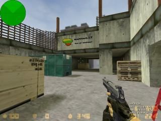
It's small bomb defuse map. I make it for one of Mapping.lt compo "finish the map". You had to finish a base map. We could not change the size of the base map.
My idea was to make de_vertigo style map. Map have 2 plants, it is small (can play 12 people (6x6)).
My idea was to make de_vertigo style map. Map have 2 plants, it is small (can play 12 people (6x6)).
7 Comments
You must log in to post a comment. You can login or register a new account.


Architecture is completely un-notable. While i see you were trying to replicate the feeling of Vertigo, and you did that very well, I can't help but feel that replicating a map that's probably 8 years old by now is a bad idea. I would have preferred to see your own graphical interpretation of the classic map, rather than something so similar.
Texturing is bland and in some cases quite odd. The concrete vent and exceptionally dull staircase are the two cases that stood out most for me. Your use of decals was quite nice, but more would have been better to add variety unless you used more varied textures.
Lighting is just as bland. The job of lighting is to amplify, compliment and add variety to the brushwork and texturing. Your lighting does none of these. Repeated use of the same dull off-cream colour just makes everything look bland. Probably the worst point.
As far as atmosphere is concerned, I noticed you only added sound in one area (bombsite B, i think.) This makes the sound stand out rather than be in the background like it should be. There shouldn't be a notable transition between silence and sound. Put some ambience in the inside areas too.
I wont bother commenting on gameplay since the map from base was far too small to make a decent game, but you at least did try to make an interesting layout in the limited space you had.
I like it. I really do... I just don't know why. sorry ):
Zinoma, reikia paminet tai, kad tu uzmirsai viena svarbiausiu isskirtiniu vertigo daliu - nukritima nuo dangoraizio, isleidzianti ta riksmo garsa. Butinai idek sekanciame mape. ;>
3* uz pastangas.
This is one of the tiniest de maps i've ever seen, and probably the only real negative comment, though it's kinda a big one. Who knows tho it might be fun as i never played it on a server...
There are also tons of small constrcution details you could have added like tools, work lights, power saws, welders, anything to make it a more believable work site. For large-scale props a big crane is begging to be on this map, plus perhaps in a future version some scafolding gameplay areas on the outside of the building, and or some more detail to the outside of the building?
YOu could also add soome bare metal substructure aboove the playable area to again make it more real.
+Nice construction throughout
+Nice texturing with some custom ones?
+Some nice large-size construction props
+neat layout
+no visual errors
*maybe could use more sounds (there was just one i think?)
-no small scale detail
-small map is small = )
All in all a fine map, tho i think it could be better. I'll go 3.5 because there although there is really nothing wrong with it, i think it could be a lot better; 3.5 rounds up to 4 = )
****