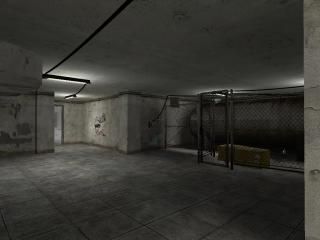
rooms_basement
entry for the rooms SOURCE collab. I'm Still new to source. So it sucks. But with community input i'm hoping to improve it.
EDIT---
Took some advice from FresheD, Improved the lighting, connected all the lights. Cleaned up the decal clutter, added a door in the fence, added an entrance door, connected lights to a power box.
EDIT---
Took some advice from FresheD, Improved the lighting, connected all the lights. Cleaned up the decal clutter, added a door in the fence, added an entrance door, connected lights to a power box.
5 Comments
You must log in to post a comment. You can login or register a new account.

 HL2
HL2


Another thing needing work is lightning, now it's just too 'normal' and you seem to be having some shadow issues (especially at the pipes). I'd advise to dense the lightning and slightly add some color to them so that it enhances more atmosphere. I like the cords between the lamps but they have no source of origin and one of them isn't connected at all.
Texturing and architecture are pretty decent but they work. You might want to practice a bit and add some more detail to make it more interesting tho. Also, I would cut down on the decals a bit, because you're overusing them. Anyways, that's just a bit of input; normally I'm not one to bash lack of realism but things just felt a bit off. Good luck!
thanks for the input it's greatly appreciated
I'll go touch things up a bit.
I like the room small as it is, and how it "flows" i guess. Theres a bit of eye candy with the nice detailed duct work (or are thosee models?) and the ligt fixtures and fenced-in area. I don't like the cords going from light to light tho, i think metal conduit would look better, or if the wires were thinner and rounder they would look more realistic.
The smallness of the room is nice for that gun that shoots the bouncy, charged particles all over, as it bounces 100 times before it fizzles out... if you can get it in between the nook of the propane tank and the wall it does quite a neat light show for you = )
Lighting was a tad too bright imo for a room like that. a service area where no routine work is done would be very minimally lit in most cases.
Anyway, i like the map, sorry for the over-analysis, but maybe something will be helpful? i rate 5 for entering the source coop while so many other people sit on the sidelines....(i swear how many people here actually map?! = )