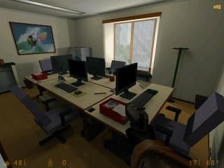
Saba Office
 HLDM
HLDM
Saba Office
by
Zemek
Posted 15 years ago2009-11-12 12:51:41 UTC •
Completed •
Half-Life: Deathmatch
- Name
- Saba Office
- By
-
 Zemek
Zemek - Type
- Map
- Engine
- Goldsource
- Game
- Half-Life: Deathmatch
- Category
- Completed
- Included
- BSP
- Created
- 15 years ago2009-11-12 12:51:41 UTC
- Updated
- 15 years ago2009-11-12 12:51:41 UTC
- Views
- 1961
- Downloads
- 614
- Comments
- 5
- Rating
- 3.50 (2)
- Reviews
- 0
This is the reproduction of my office.
I hope you like it. Enjoy!
-Zemek -
I hope you like it. Enjoy!
-Zemek -
5 Comments
You must log in to post a comment. You can login or register a new account.


-Ambient sounds would be nice
-There should be more routes around
-You should probably func_wall the objects on the desk, they're giving the desk ugly brush clipping.
Keep at it!
-Zemek-
Zemek
rats maps i've seen.
++originality
++implementation
!nice architecture in many places, but very boxy in others
!same with texturing as above
!great detailing in many ares but very bland in others.
-plus 6000 wpolys in most areas, but should be ok for new computers
-face splitting in areas that could be easily avoided by func_walling some stuff
I'm going 4 stars on this one. i would easily rate it 5 if the quality work was more consistent across the map.
cheers!
4 stars