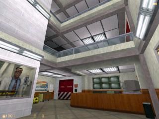
Disco Stu's cubicles project entry
 HL
HL
Disco Stu's cubicles project entry
by
DiscoStu
Posted 14 years ago2010-03-22 23:16:53 UTC •
Completed •
Half-Life
My finished cubicle. I hope you enjoy it! Ratings are enabled now.
Hints: Eh... whatever. Go somewhere. Walk around.
Useless trivia: On the last test run, instead of getting shot, I got kicked in the groin. That'd be the very first time I get that in Half Life.
Update: Due to popular complaints, added more hints at how to get upstairs. And fixed some misaligned textures.
18 Comments
You must log in to post a comment. You can login or register a new account.


Ill fix that.
I also turned the window frame into illusionaries to make sure the grunts don't get stuck on that. It's a pretty tight space there.
Here you go: http://www.themightyatom.nl/stuff/discostu_cubicles_fixed.zip
That's incredible.
Nicely constructed and detailed, and very nice use of
the original textures.
I'd rate 5 if you had them not disabled..
= )
great stuff all around, a really good cubicles entry!
5
You did well enough with the default textures.
The architecture was mostly very thick, and the map felt very flat because of it. The trims were very nice, though, especially on the ceilings.
It also sounded like that computer noise was coming from nowhere, certainly not from the computer at least.
If there was supposed to be some way to get to the two upper floors, I either missed something obvious or the map broke on me. There was nothing tall enough to push to be able to jump onto the trims, and scouring the map in a use-button frenzy revealed nothing helpful.
Does it have to be flat? Do you see sharp?
Do you mind explaining how does it look flat? I'd like to learn how others see my map...
Thanks for comments & ratings
Anyway, i couldn't find a way to get upstairs, If your even able to go there anyway. 4 stars for this small area.
In the context of the competition, i think it is, but as a stand-alone map i would agree with you. I disagree with you tho, i think it is a superbly well-crafted map, and if it was a normal size, it would be worth 5 stars on it's own.
@SM: Look again... please
@Zeeba: Thanks. I'm sick of the original textures too. But I suck at making custom textures and don't know where to get more, so I work with what I have.
@Capt: Once again, thanks! (But if it were a normal size, maybe I wouldn't be able to finish it :P)
I like the wire coils. Perhaps you should use the toolbox .mdl file instead of the brush one? Just a suggestion.
Breakable screens in the lobby = happy