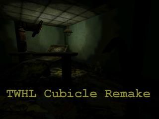
TWHL Cubicles: Asylum Operation Room
 HL
HL
TWHL Cubicles: Asylum Operation Room
by
Suparsonik
Posted 14 years ago2010-06-07 20:15:50 UTC •
Completed •
Half-Life
- Name
- TWHL Cubicles: Asylum Operation Room
- By
-
 Suparsonik
 - Type
- Map
- Engine
- Goldsource
- Game
- Half-Life
- Category
- Completed
- Included
- BSP, RMF/VMF
- Created
- 14 years ago2010-06-07 20:15:50 UTC
- Updated
- 3 years ago2020-12-24 03:21:42 UTC
- Views
- 3039
- Downloads
- 766
- Comments
- 8
- Rating
- 4.00 (1)
- Reviews
- 0
TWHL Cubicle Remake
I know it's not the best, but I had rushed to get it done because I have other map(s) to work on. But, we all know it's much better than my other one although this one doesn't have Green Onions (which is like Rimrook's favorite song btw).
HINT: Press E (use key) right after the map loads and move backwards, trust me you'll be thanking me later.
8 Comments
You must log in to post a comment. You can login or register a new account.


I had to rush because I have other things to do and I'm not going to let this hold me back.
I'm happy with it anyways. The only thing that is a problem is that the doors on the second floor and third don't display the lock sound.
Also, fix that "monster stuck in brush" error that causes the ugly/annoying "firefly" effect.
= )