Beta5th
 HLDM
HLDM

Beta5th
by
4N!M4T0R
Posted 13 years ago2011-04-02 15:57:21 UTC •
Completed •
Half-Life: Deathmatch
Loading...

- Name
- Beta5th
- By
-
 4N!M4T0R
 - Type
- Map
- Engine
- Goldsource
- Game
- Half-Life: Deathmatch
- Category
- Completed
- Included
- BSP
- Created
- 13 years ago2011-04-02 15:57:21 UTC
- Updated
- 13 years ago2011-04-03 14:47:27 UTC
- Views
- 2204
- Downloads
- 629
- Comments
- 5
- Rating
- 3.50 (2)
- Reviews
- 0


After two years from release of Alpha4th map. Here comes the sequel - Beta5th.
Really enjoyable Half-Life Deathmach map!
Thank you for playing!
Have lots of fun
Special thanks for: Dragos, Rufee and Half-Life.lt
Check out Alpha4th map
Really enjoyable Half-Life Deathmach map!
Thank you for playing!
Have lots of fun
Special thanks for: Dragos, Rufee and Half-Life.lt
Check out Alpha4th map
5 Comments
You must log in to post a comment. You can login or register a new account.
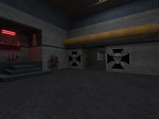
++The lighting - It wasn't to dark or too light for the area you were in, I have to admit.
++The Architecture - You did good with the areas all around.
-+The Large Open Areas - There were too many of these, and it would be helpful if you put a few objects or decals there to keep it from looking bland.
All in all, 2.5, but what the heck, 3.
+ Architecture. super pretty much everyehere.
+/- Lighting: i feel lighting was fine, but a little too consistent throughout, which lends itself to some drab, visual boredom after while. Make some areas brighter would be my advice.
+ Very nicely detailed, though i'd like to see some more small detail and props in places
+/- Texturing is adequete, but this nice map architecture would look prettier with some different texturing in places. Same as the lighting, a little too consistent/drab.
+Layout is nice and seems like it would lend itself to some fun gameplay
-Visual effects: turn those screens into texlights (the video control room) for a very nice effect. add a transparent piece of glass in front to mimic a screen if you want. Make some buttons texlights on there as well to add some visual intrest.
-Agree with Dimbark about adding some more cover in the big areas(NOT CRATES THO) =)
3.5 for a very solid map rounds up to 4 in my book. A good map with the potential to very easlily be a great one.