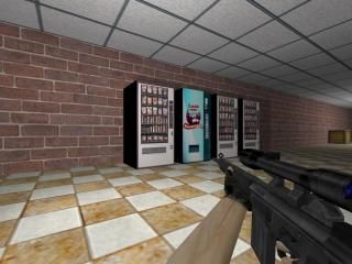
ridge_high
ridge_high map created by Rush. e-mail me at rush8799@yahoo.com with questions, problems, etc.
This map is based on ridge high school located in New Jersey.
Instructions:
CT's: Kill T's
T's: Kill CT's
This map is based on ridge high school located in New Jersey.
Instructions:
CT's: Kill T's
T's: Kill CT's
2 Comments
You must log in to post a comment. You can login or register a new account.

 CS
CS


But, judging this map from aspects of game play and looks wouldn't be quite logical. The game play is ok to some level, but its not perfect.
I will give you 4 starts for effort. Keep on mapping
Lots of neat things about this map but there are also lots of fundamental problems.
Not problems really, but just a phase that every mapper goes through in the beginning. I'll try to give some tips, not going into too much detail because many of the things i'm gonna say, probably won't really make sense until you have had more experience with hammer.
-scale. your scale is way too big in most of the map. if you need to, use some cyclers of a scientist or some other model, to use as a general reference for the proper height/witdth/breadth of things.
-textures. your texture choices are pretty generic. try to stay away from the default half-life ones because they are mostly pretty bad. Also, pay attnetion that your texture scaling is not too big as to look cartoonish(like the brick texture that dominates most of the school).
-detail. for a map this big you will require A LOT of detail to finish it off. Examples would be more furniture and accoutrements in the classrooms, hallways, to make the spaces more believable or "lived in".
-layout. i love that you included working doors to all the rooms but keep in mind from a gameplay perspective it might not be the smartest thing. and you might want to block off some areas so the layout is less repetative or copypasta. (if you DO decide to keep all the rooms accessible, try to vary them with distinct details to be less boring, and to act as landmarks so they are easily distingushable from one room to the next.
-lighting. like everything else, try to keep it more varied with different brightnesses for differnt areas of the map. Explore texture lights as soon as you can if you plan on being a goldsource mapper
Sorry for the TL:DR, and good luck with your mapping! =P